
Mathematics is used in interesting, and often less than accurate, ways. Newspapers present graphs showing apparently correlated variables, but with a little thought, some of the time you will find that whilst it looks like two variables are connected, there is actually no cause and effect. Sometimes this is because there is a third factor causing the movements in the variables — for example, if it is hot and sunny, sales of sunscreen lotion increase, as do sales of air-conditioners. If you plot these sales against each other, you find a correlation. However, they are only connected because of a third variable, the summer weather. Of course, an unscrupulous media can draw connections where they don't exist for more political ends, such as blaming an increase in crime on the sales of hooded sweatshirts. And politicians have been known to confuse cause and effect, thinking that a local crime increase is due to the increased police presence, rather than the other way around.
Whilst it is interesting to examine these graphs in order to find out the true cause of the correlation, sometimes there just isn't an underlying factor. I recently saw in a UK newspaper a chart relating the behaviour of the NASDAQ technology index in the 8 years prior to the dot-com bubble burst of 2000, to the price of crude oil over the last 8 years. And whilst the article was careful to point out that the two indices are unrelated — the point of the article being that markets tend to overprice things — at first glance you would suspect that oil prices are due for a crash.
The problem is that not only does the graph present different time periods and so different market conditions, but oil prices and technology stocks are completely unrelated. You could never use the NASDAQ to predict oil prices — we all need energy, but we don't all need technology shares. They may look similar, but there is no cause and effect. Whilst there may be some hidden time and consumer behaviour variables that have affected both prices, the trend is largely coincidental.
So, I thought to myself, what else could we plot against oil price? I tried to think of the most unconnected statistic I could. Let's examine the Australian Cricket Team's Test winning percentage — that is, its percentage of wins in the previous 40 games — between 1982 and 2004. As before, we have different time periods and unconnected variables:
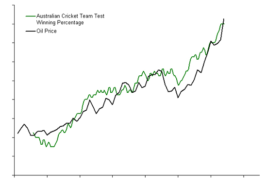
The fortunes of the Australian cricket team to blame?
As you can see, the correlation is remarkable, even down to small rises and falls. So, when you fill up this week and notice the latest price rise, you can stop blaming OPEC and strife in the Middle East, and start blaming Allan Border, Mark Taylor and Steve Waugh for improving the results of the Australian Test Cricket Team! By the way, the data are completely real — make this graph for yourself at Cricinfo and Oil and Gas Confidential.