
Five tools to explain something technical
If you are reading this you are clearly someone who likes understanding maths and science. How do you choose to explain these ideas to other people? What explanations do you find easiest to understand? There are many different ways of explaining technical ideas, and in this article Shane Latchman uses his experience as a catastrophe modeller to shed light on different ways of communicating mathematics, and how using a range of strategies can give the most intuitive understanding.
In my job in catastrophe modelling, when explaining a concept to our clients—who represent a range of scientific and non-scientific backgrounds—it's best to use many different tools to communicate technical ideas. Depending on the aim of the situation, some tools will be more appropriate than others. If the aim is to provide a high-level understanding, mathematical formulae may not be needed, whereas to write code to model the concept computationally, mathematical formulae are often essential. In virtually all cases an image helps and where a demonstration is possible, this will likely aid everyone's understanding. In essence, we're always communicating using maths, we're just using different tools to do so.
Here are five tools from my toolbox that I use to explain a technical concept. And because some tools tend to resonate more with some people than others, I always try to use at least two or three tools to explain something.
- Mathematical formulae and definitions
- Worked example
- Image, such as a graph or picture
- Story, especially with imagery, such as an analogy, real life application, or historical example
- Demonstration, such as a video or in-person in a lab
Mathematical formulae
I'll use the first three tools – formulae, an example and an image – to explain the concept of convolution.
Convolution is the process of adding together two probability distributions. This is a problem seen in statistics where you know the shape of the probability distribution for two separate random variables and you need to know the shape of the sum of these variables. In catastrophe modelling, for example, convolution is used to understand the uncertainty around losses caused by an event, which is itself a combination of probability distributions of losses from n individual locations.
Convolution is generally represented by the mathematical formulae below, where  and
and  are the functions describing the probability distributions being convolved and
  denotes each point on the distribution. The combined distribution is the sum of the product of and .
![\[ (f\circ g)(t)=\int f(\tau )g(t-\tau )d\tau τ . \]](/MI/01862ae5a0e33bcb27ea8c35eb015fc1/images/img-0004.png) |
Example
A worked example helps to highlight the relevance of what is being explained. Let's use the example of the probability distribution for the score resulting from a throw of a single die, and the combined score from throwing two dice.
When throwing a single die, the probability distribution for any score is flat: any outcome is equally likely. To find the probability distribution of the combined score across two dice, the total score for the two dice is listed alongside all the outcomes that can lead to that score. The probability of a total score is the number of outcomes that can lead to the combined score divided by the total number of outcomes.
| Die 1 + Die 2 |
Outcomes | Number of outcomes |
Probability |
|---|---|---|---|
| 2 | (1,1) | 1 | 0.03 |
| 3 | (1,2) (2,1) | 2 | 0.06 |
| 4 | (1,3) (2,2) (3,1) | 3 | 0.08 |
| 5 | (1,4) (2,3) (3,2) (4,1) | 4 | 0.11 |
| 6 | (1,5) (2,4) (3,3) (4,2) (5,1) | 5 | 0.14 |
| 7 | (1,6) (2,5) (3,4) (4,3) (5,2) (6,1) | 6 | 0.17 |
| 8 | (2,6) (3,5) (4,4) (5,3) (6,2) | 5 | 0.14 |
| 9 | (3,6) (4,5) (5,4) (6,3) | 4 | 0.11 |
| 10 | (4,6) (5,5) (6,4) | 3 | 0.08 |
| 11 | (5,6) (6,5) | 2 | 0.06 |
| 12 | (6,6) | 1 | 0.03 |
| Total | 36 | 1 | |
Seeing the individual outcomes that lead to the different total scores can be very helpful. It's now easier to understand how convolving flat uniform individual score distributions leads to a peaked convolved distribution.
The great Trinidad-born Nobel Laureate V.S. Naipaul once said: "When you write a sentence, try to make it say two things. This is the secret of writing." Similarly, I find that when explaining concepts it's ideal if you can get a tool to explain two things at the same time – here the example shows step-by-step calculations and the shape of the resulting distribution in the Outcomes column.
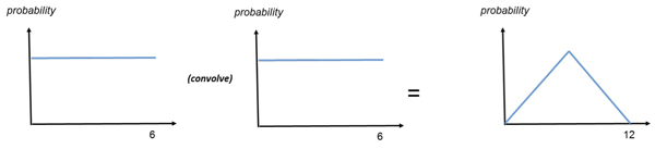
Image
Including an image – for example a graph of the mathematical equation or a figure or picture, or something more conceptual such as a flow diagram – should always help people to understand. The shape of the distribution for throwing a single die, and the shape of the combined probability distribution of the score across two dice are shown below. Seeing these distributions as images enhances the understanding of the mathematical concept and makes it clear that convolving two flat distributions can result in a peaked distribution.
Story
Now we will change the concept we are explaining to demonstrate the next two tools: a story and a demonstration.
A story can use lots of imagery to help the listener imagine the situation; analogies can help here, too. For example, my maths teacher at A level loved geometry and would relate the mean value of a probability distribution to its centre of mass. That really helped us get an intuitive understanding of what the mean value was because you could imagine cutting a shape of the distribution from a piece of card and then balancing it on a ruler at that mean point.

Resonance is why even a little push can help you swing higher (Photo: Slash – CC BY-SA 3.0
But I digress. A common question in catastrophe modelling is why, during an earthquake, buildings of different heights move more as the type of shaking changes. The concept we want to explain here is resonance, which occurs when the frequency of applying a force matches the natural frequency of an object, resulting in it vibrating with the maximum amplitude. Every object has a natural frequency, which is the frequency it vibrates with when struck.
To help understand the concept of resonance, imagine pushing a child on a swing. The swing has a natural period—the length of time the child takes to move away from you and come back again. The natural frequency is the inverse of the natural period. When the child wants to go higher you push exactly when the child has swung all the way back. Pushing at any different time won't increase the height of the child's swinging (their amplitude). So, the frequency of the forcing – the frequency of your pushing – matches the natural frequency and they go higher (their amplitude increases).
Earthquakes are no different. Resonance occurs if the frequency of the earthquake matches the natural frequency of the building (which is a function of its height), and if resonance occurs it can collapse the building. This happened in an earthquake that impacted Mexico in 1985 where apartments of a specific height in Mexico City matched the earthquake’s shaking frequency and collapsed; buildings that were shorter or taller did not.
Demonstration
Finally we can use Lego Duplo to produce a piece that is an elegant demonstration of this concept. At the start of the video you can see that the taller building has greater amplitude at lower frequencies when the shaking is slower. Conversely the shorter building has greater amplitudes at higher frequencies when the shaking is faster.
It often requires a range of communication strategies to explain and understand a technical concept. Mathematical equations can deepen my understanding, but a story or an image may give more of an intuitive understanding. Formal mathematical language is important, and often the first thing used when teaching technical concepts. But other methods of explanation are more than just nice to have, they can be vital for helping create real understanding.
About the author

Shane Latchman is Vice President and Managing Director of AIR’s London office. He interacts frequently with rating agencies and regulators on topics such as stress tests and climate change. Shane writes and speaks frequently on various topics including catastrophe risk and climate change. Shane studied Actuarial Science at City University and received a B.Sc. with honours. He earned a Master's in Mathematics from the University of Cambridge.