Logistic growth: The mathematics of COVID variants
You might have noticed that BA.2, a new "improved" version of the Omicron variant, has hit the news. We've become all too familiar with the fact that new variants of COVID-19 can, and do, arise at any time. When this happens it's important to know if such a new variant is likely to become dominant and how long that might take.
Amazingly it's possible to do this very early on, as epidemiologist Thomas House was able to do shortly after the arrival of Omicron in Scotland in November 2021. Thanks to the mathematics of logistic growth, he realised that this new variant would rapidly take over from the previously dominant Delta variant, faster than any variant that had emerged before. "It was terrifying to realise how fast it was, and that we couldn't do anything about it," says House.
Exponential growth
Before we compare variants, let's first look at exponential growth, the behaviour we've seen from absolute numbers of COVID-19 cases, hospitalisations or deaths, particularly at times such as March or December 2020 when the epidemic was out of control. While exponential growth of cases can never go on forever (because the virus runs out of new people to infect), without significant changes in circumstances (such as changes to COVID policy restrictions) this simple model can provide good predictions of the future for weeks or even months at a time.
See here for all our coverage of the COVID-19 pandemic.
However, when we try to plot exponentially growing cases on a standard graph, we find a problem. For a long period of time the curve is fairly flat, before apparently leaping up out of control. This early behaviour can give us a false sense of security, and it can be hard to predict by eye how high the curve will go next, because all exponential curves look more or less the same.
For this reason, mathematicians often plot the logarithm of the number of cases. These logarithmic plots squash up the vertical axis of the graph so that the step from 10 to 20 is the same as the step from 100 to 200, or 1000 to 2000. Doing this has the advantage that any rate of exponential growth gives a straight line on a logarithmic plot, which is easy to extrapolate by eye. Furthermore, the slope of the line tells us how fast the epidemic is growing (this is the growth rate), allowing us to deduce the doubling time.
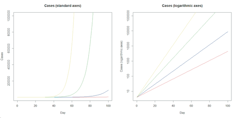
The plot on the left shows exponential growth, it’s easy to see early behaviour would give a false sense of security. The logarithmic plot on the right squashes the vertical axis as it rises. The direction of exponential growth is clear on this logarithmic plot - the slope of the line gives the growth rate, allowing us to deduce the doubling time. Click here for a larger version of these figures.
Logistic growth
When it comes to comparing variants we are often interested in understanding not just the absolute number of cases, but also the percentage of cases belonging to the new variant. What's fascinating is that each time a new variant takes over, without any changes to COVID policy, we will see the same kind of S-shaped curve when we plot this proportion.
At first, for a soon-to-be-dominant variant, the proportion grows roughly exponentially. However, since the proportion must always be less than 100%, we know this behaviour cannot go on forever. Indeed, the curve gradually straightens out at around the point the variant becomes dominant (reaches 50%), before starting to flatten out as the percentage gets close to 100%. This is called logistic growth.
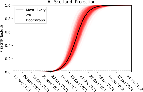
The logistic growth of the Omicron variant in Scotland. The graph shows the projection for change in the proportion of Omicron cases, detected via their lack of the S-gene.
For example, as Omicron took over from Delta in December 2021, scientists could estimate the competitive advantage which the new variant held over the old by tracking the proportion of cases which were missing a particular genetic feature. The presence or absence of this S-gene can be detected with standard PCR tests – detecting the rise of a new variant much earlier than waiting on data from the small number of tests that are genetically sequenced. (You can read more about how this has been used to detect the rise of new variants before in our article on the Delta variant.) The curve above shows the S-shaped curve describing the proportion of Omicron to Delta, detected via the S-gene feature.
Straightening the S-curve
Interestingly, a simple mathematical model (see the accompanying article) does a very good job of explaining the way in which the proportion of a new variant changes as it grows dominant over another. Furthermore, just as plotting the number of cases on logarithmic plots allows us to represent the exponential growth in cases as a straight line, another clever mathematical transformation of the axes does the same for each S-shaped curve. Such curves are often referred to as logistic curves, and the axes which turn them into a straight line are called logistic axes. In comparison to the logarithmic axes, the vertical logistic axis becomes more and more squashed towards the middle, the point over which the variant has become dominant, and the axis is stretched out towards 0 and 100%.
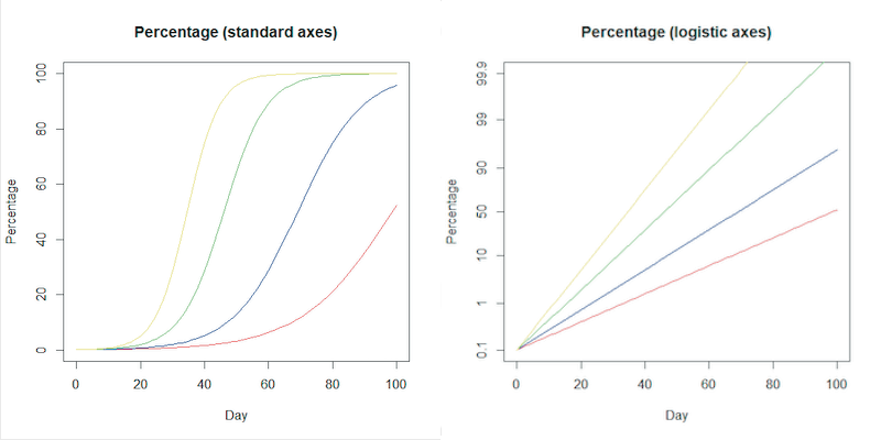
On the standard axes on the left, some examples of logistic curves showing the way the proportion of a variant will grow to become dominant. On the right the logistic S-curves become straight lines when plotted on logistic axes on the right, using the transformation explained in the accompanying article. Click here for a larger version of these figures.
Just as with the logarithmic plots, this is not just a clever piece of mathematics. Again, the straight line carries information — steeper slopes mean the new variant is taking over faster. By estimating the slope of the line from early data, we can see what kind of competitive advantage a new variant has. This allows us to tell how fast the new variant is likely to become dominant, and to predict what this might do to overall case numbers. This was why it was possible to tell early in December that Omicron would shortly cause a steep rise in overall UK COVID cases, even while the absolute number of Omicron cases was very small. (See the accompanying article for details.)
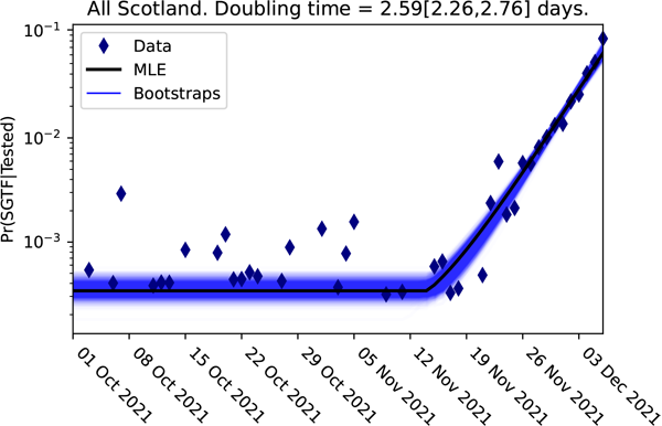
The logistic plot of the proportion of the cases lacking the S-gene for the Scottish data up to 3 December 2021
Here from the logistic plot for cases lacking the S-gene in Scotland, it is obvious that a significant change happened sometime during the week beginning 12 November 2021. The change to the slope of this graph represents the arrival of the Omicron variant. This straight line, with this new steeper slope, could be projected forwards in time to project the timescale of the dominance of the Omicron. Reversing this logistic transformation to plot the projection on a normal scale below, we can see how closely the projected timescale (red) matched the real timescale observed in Scotland (blue).
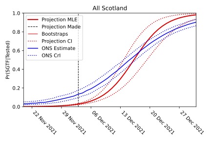
The projection that the Omicron variant would become dominant is shown in red (with the dotted lines giving the confidence interval). Despite being made when Omicron made up less than 2% of cases, the projection agrees with the timescale of the comparable data observed by the ONS survey.
A straight line to BA.2
We can now see the same logistic growth occurring for the BA.2 version of the Omicron variant as it becomes dominant. As the plot below shows, the projection using a logistic model for the growth closely matches the data for the numbers of BA.2 cases in England (data from COVID-19 Genomics UK consortium via Dave McNally).
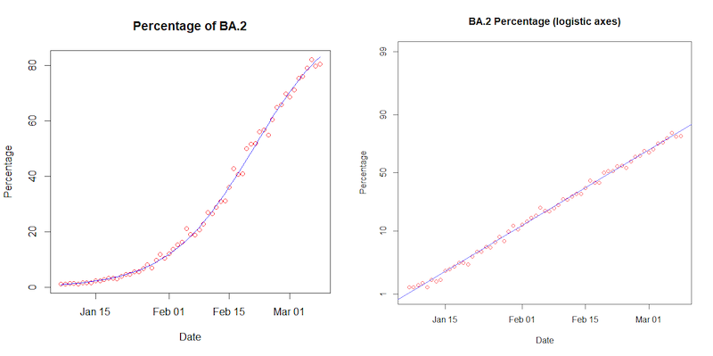
On the left, the proportion of COVID-19 cases that are BA.2 produces the familiar S-curve on a normal scale, and a straight line on the logistic scale. The red circles are for BA.2 data collected for England, the blue line is the projection using the mathematics of logistic growth. (Data from COVID-19 Genomics UK consortium via Dave McNally).
The mathematics of logistic growth is incredibly elegant, and incredibly powerful. It allows us to reliably predict the growth of dominant variants early on. But these S-shaped logistic curves crop up in a lot of other places, in settings ranging from the launch of the iPhone to the growth of wild animal populations. Logistic growth describes anything that grows exponentially, but is competing against the growth of other competitors for the same market.
Find out all the mathematical details in the accompanying article.
About the authors

Thomas House
Thomas House is Professor in Mathematical Statistics at the Department of Mathematics at the University of Manchester and a member of the JUNIPER modelling consortium and the modelling group SPI-M, and contributes to the Scientific Advisory Group for Emergencies (SAGE). This article draws on his work for the Scottish government.

Oliver Johnson
Oliver Johnson is Professor of Information Theory and Director of the Institute for Statistical Science in the School of Mathematics at the University of Bristol. He has been tweeting about the maths of the COVID pandemic as @BristOliver.
Rachel Thomas is Editor of Plus.
This article is part of our collaboration with JUNIPER, the Joint UNIversity Pandemic and Epidemic Response modelling consortium. JUNIPER comprises academics from the universities of Cambridge, Warwick, Bristol, Exeter, Oxford, Manchester, and Lancaster, who are using a range of mathematical and statistical techniques to address pressing questions about the control of COVID-19. You can see more content produced with JUNIPER here.