How maths can help you get ahead of the S-curve
This article accompanies our article on the mathematics of COVID variants, which you might want to read first. To find out more about growth rates, which we will be mentioning here, see this article.
Suppose two variants of COVID-19 are spreading through the population, each behaving exponentially with the growth rates  and
and  respectively (the growth rates can be positive or negative, quantifying the growth or shrinking of these variants). The number of new cases of variant 1 and variant 2 at time
  respectively, are
![\[ A_1 e^{r_1 t} \; \; \; \mbox{and}\; \; \; A_2 e^{r_2 t}, \]](/MI/c949d9d36a4fdc4884020a8c7f35ed39/images/img-0001.png) |
 and
and  are constants.
We can monitor the dominance of a variant by plotting how the proportion of cases of that variant changes over time, producing the S-curves we saw above. As there are only two variants in the population, the proportion that are variant 1 would be
![\[ P_1(t) = \frac{A_1 e^{r_1t} }{A_1 e^{r_1t} + A_2 e^{r_2t}}. \]](/MI/59f4ed31e4da7648350bd18d86692ccf/images/img-0001.png) |
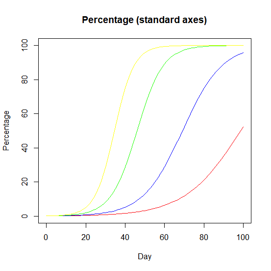
If the variant will become dominant, then a plot of how the proportion of cases of a variant changes over time produces logistic S-curves.
An equivalent way to keep track is to consider the change over time of the odds of a case being a particular variant. As we only have two variants to consider these odds are written as:
![\[ \frac{P_1(t) }{1 - P_1(t)} = \frac{P_1(t)}{P_2(t)} = \frac{A_1 e^{r_1t}}{A_2 e^{r_2t}} = \frac{A_1}{ A_2} e^{(r_1 - r_2)t}. \]](/MI/390cf352609fae92a1d1bcd8906b8a39/images/img-0001.png) |
And here is where a little bit of magic happens: although the denominators of the fractions that we write for  and
and  are unpleasant expressions, they cancel out when we calculate the odds, leaving something much nicer.
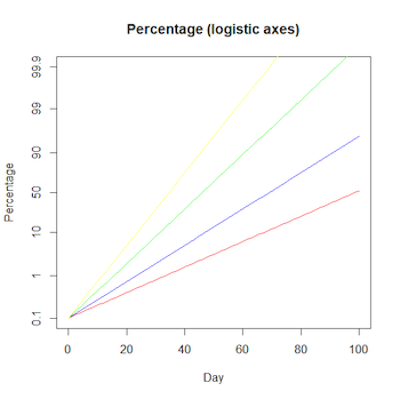
The logistic S-curves we saw above become straight lines when plotted on logistic axes. This is where we plot the logarithm of the how the odds a case is a particular variant - the log odds of a variant - changes over time.
Then if we plot the logarithm of these — the log odds for this variant — we will get a straight line
![\[ (r_1 - r_2)t + c, \]](/MI/289268683a1789de62dffefc9e4b8081/images/img-0001.png) |
(where  is the logarithm of the constant
  ) . Plotting the log odds is the clever logistic transformation that turns the S-curve into a straight line on logistic axes.
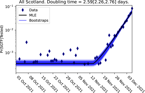
The logistic plot of the proportion of the cases lacking the S-gene for the Scottish data up to 3 December 2021.
Here from the log odds plot for the Omicron variant in Scotland, it is obvious that a significant change happened sometime during the week beginning 12 November 2021. The change to the slope of this graph represents the arrival of the Omicron variant. We can quantify Omicron's clear competitive advantage from the new slope in this logistic plot, giving the difference in the growth rates  between the omicron and delta variants.
We can project this straight line, with this new slope, forwards in time, and reverse the logistic transformation to project the dominance of the Omicron variant as a logistic curve.
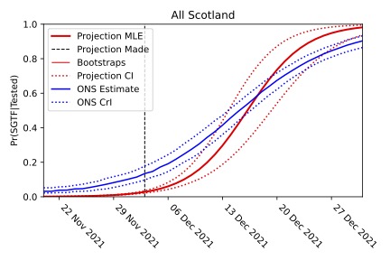
The projection that the Omicron variant would become dominant is shown in red (with the dotted lines giving the confidence interval). Despite being made when Omicron made up less than 2% of cases, the projection agrees with the timescale of the comparable data observed by the ONS survey.
The plot above is the proportion of the Omicron cases (identified by their lack of the S-gene) based on the early data and projected forward in time using the mathematics of logistic growth. This mathematical analysis made it clear that the Omicron variant would take over, despite Omicron making up less than 2% of all the COVID cases at the time of this projection. And this projection turned out to match the real growth of the Omicron variant, and the timescale for it to become dominant, incredibly accurately. The mathematics of logistic growth — the straightening of the S-curve — provided a very effective early warning system.
About the authors
Thomas House is Professor in Mathematical Statistics at the Department of Mathematics at the University of Manchester and a member of the JUNIPER modelling consortium and the modelling group SPI-M, and contributes to the Scientific Advisory Group for Emergencies (SAGE). This article draws on his work for the Scottish government.
Oliver Johnson is Professor of Information Theory and Director of the Institute for Statistical Science in the School of Mathematics at the University of Bristol. He has been tweeting about the maths of the COVID pandemic as @BristOliver.
Rachel Thomas is Editor of Plus.
This article is part of our collaboration with JUNIPER, the Joint UNIversity Pandemic and Epidemic Response modelling consortium. JUNIPER comprises academics from the universities of Cambridge, Warwick, Bristol, Exeter, Oxford, Manchester, and Lancaster, who are using a range of mathematical and statistical techniques to address pressing questions about the control of COVID-19. You can see more content produced with JUNIPER here.