Shining a light on COVID modelling
"Thanks to some questionable modelling — poorly presented and often misrepresented — it is true to say that never before has so much harm been done to so many by so few, based on so little, potentially flawed data. It is a national scandal."
These were the words of Bob Seely MP during a parliamentary debate on January 18, 2022 and repeated in the Daily Mail a few days later. Seely was referring to the epidemiological models that have informed UK policy on the COVID-19 pandemic which, he claimed, projected "doomsdays scenarios" and provided "the ammunition that drove lockdown and created a climate of manipulated fear".
Was Seely right? Since the outputs of these models are numbers — of cases, hospitalisations, and deaths — it is possible to check, simply by comparing projections against what really happened. The team behind one of the main models used to inform policy has recently done just that, and found that their projections generally provided good agreement with what was eventually observed.
"We were under-estimating as often as we were over-estimating with our projections," says Matt Keeling who leads the team based at University of Warwick. Indeed, the paper recently published by the team finds that "in general the models have performed remarkably well, often aligning with the real reported levels of hospital admissions over multiple months."
What the Warwick team did
Keeling and his team at the Zeeman Institute for Systems Biology & Infectious Disease Epidemiology Research were involved in the response to COVID-19 since the start of the pandemic, among other things developing a complex mathematical model designed to project the course of the pandemic throughout the UK (to get an idea of how such epidemiological models look like, see this article). Results of the team's work were presented to the Scientific Pandemic Influenza Group on Modelling, otherwise known as SPI-M, which feeds its result to SAGE (the Scientific Advisory Group for Emergencies). Keeling himself has contributed to SAGE, sits on the Joint Council for Vaccination and Immunisation and has received an OBE for his work on COVID-19. His co-authors on the recent paper, Louise Dyson, Mike Tildesley, Ed Hill and Sam Moore have all contributed to SPI-M and the team forms part of the JUNIPER modelling consortium
The Warwick team's model helped to inform the roadmap out of lockdown.
In particular, the Warwick model provided projections for each of the four steps of the roadmap out of lockdown that was implemented in the first half of 2021. "We did these projections working very closely with SPI-M and SAGE to look at steps 1 to 4 in the roadmap, which took us from the lockdown in January 2021 all the way through to there being no restrictions on social gatherings, which happened in July," says Keeling.
"Each time we were coming up to one of these steps we used the model with all the latest information we knew, to try and work out what was going to happen at the next step, and all the subsequent ones as well."
Reflecting uncertainty
It was these roadmap projections that, in their recent paper, the Warwick team compared to how the pandemic eventually played out in reality. What's important to realise here is that the projections were not meant as sure-fire forecasts — there was far too much uncertainty to be sure about anything — rather they presented "what if" scenarios: if the vaccines are effective against a new variant to such-and-such an extent, and the loosening of restrictions increases people's contact rates by such-an-such an amount, then this is what seems most likely to happen.
Importantly, the team always presented a range of scenarios, each based on a particular set of assumptions for variables at play. For each scenario the projection produced those now familiar curves representing, for example, the number of daily hospital admissions that could be expected over time. But these curves also came with envelopes surrounding them, which further reflect the uncertainties involved: while it was impossible to be sure the true numbers would lie exactly on the curve for a given scenario, there was a 95% chance they would at least lie within the envelope shown. You will see this illustrated in the plots below.
See here for all our coverage of the COVID-19 pandemic.
Keeling also stresses that his team's work was not about deciding on policy. "We have to be careful that we only communicate the science and don't stray into policy," he says. "We are never in a position to do that because we haven't got all the pieces of information that go into the decision. We are only looking at one side of the picture - the health consequences."
The largely positive verdict the team arrived at after comparing projected against real data comes from focussing mostly on daily hospital admissions, and to a lesser extent on the level of hospital occupancy and number of deaths. In general, the real data up to September 2021 generally fell within the relevant 95% projection intervals we just described. This, the team argue, means that the projections gave policy makers a useful tool, enabling them to assess best-case, worst-case (and definitely not just doomsday) scenarios.
Vaccines and people
Academic papers are not usually emotional rollercoasters, but the Warwick team's recent effort comes close, evoking everything that happened during the perilous first half of last year. The deep winter lockdown in response to the Alpha variant, gradual re-openings allowing outdoor meetings and visits to the hairdresser, school bubbles, pub gardens, the arrival of Delta, "freedom day", the pingdemic.
Each turn in the road presented researchers with new uncertainties. No sooner had the vaccines been developed than the Alpha variant came along, rendering estimates on how well they would work extremely uncertain — with the same happening again in late spring for Delta. How many people would go and get the vaccine also wasn't clear at the start, nor was how people would behave more generally. Would opening pubs mean that people flock to them, or would they behave more cautiously? Indeed, the efficacy of the vaccines and people's behaviour are the two main sources of uncertainty the Warwick team quote in their paper.
The first step out of lockdown
All this is illustrated by the team's first roadmap projection, published in early February 2021. At the time, it wasn't clear exactly how many steps of unlocking there would be and when they would happen, which is why the team considered four possible timing scenarios. The three scenarios that best matched what eventually happened are shown in blue (fast relaxation, measures scrapped by June), orange (fast relaxation, measures scrapped by July) and yellow (slow relaxation, measures scrapped by August) in the plots below.
| Central | Cautious | |||
| Protection against: | Dose 1 | Dose 2 | Dose 1 | Dose 2 |
| Infection | 48% | 60% | 24% | 30% |
| Symptoms | 70% | 88% | 56% | 70% |
| Hospitalisation | 70% | 88% | 56% | 70% |
| Deaths | 70% | 88% | 56% | 70% |
| Onward transmission | 0% | 0% | 0% | 0% |
The researchers assumed that, whenever there was a loosening of restrictions in these scenarios, people would immediately take advantage of their new freedoms, so there'd be a step-change in their precautionary behaviour. In reality people actually turned out to be a lot more cautious, changing their behaviour very gradually. "This sounds blatantly obvious with hindsight, but actually nobody picks it up at the time," says Keeling.
Another thing that was unclear at the time was the efficacy of the vaccines against the Alpha variant, which is why the researchers considered two scenarios based on the information they did have — an optimistic scenario and a more pessimistic one (see the table on the right for the assumptions).
The plot below shows real data (dots) versus projected data (lines and shaded areas) for the more optimistic ("central") vaccine assumption, together with an additional assumption that a certain level of precautionary behaviour remains after the last step of the roadmap. See the caption for more explanation.
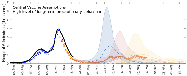
Roadmap 1 projections for the number of hospital admissions in England. Blue dots represent the actual data that had been collected up until the time the projection was made, and orange dots the data was eventually observed. The blue, yellow, and orange dashed curves represent the projections for the three timing scenarios, with shaded regions representing the 95% projection intervals described above. These results come from assuming a relatively high level of long-term precautionary behaviour, other assumptions were investigated in the paper, from which he figure is taken. Used by permission.
The plot shows a good agreement between projections and what eventually happened in terms of hospital admissions, especially for the orange and yellow timing scenarios. The modelling did however overestimate the number of deaths. The Warwick team say that this is likely to be due to the better treatments for COVID-19 becoming available throughout 2021. (See the paper for the curves for hospital occupancy and the number of deaths.)
The last step of the roadmap
"The most difficult step was roadmap 4," says Keeling. "The question was whether we were going to remove all restrictions, and the Delta variant had just come in. We initially had no idea about how well the vaccine would protect against Delta as the data were very, very sparse."
As you'll probably remember, step 4 of the roadmap — "freedom day" — was eventually delayed because of Delta. "They delayed step 4 primarily because of the uncertainty," says Keeling. "It was not about the projections saying that things were definitely going to become problematic, but simply saying that we couldn't be certain, there were too many unknowns at this time."
When a little more data about the vaccines had come in, the team produced Step 4b projections in early July. By then they had also had time to capture gradual changes in behaviour, reflecting the fact that people weren't necessarily going to all run back to the pubs and shops as soon as they were opened. This is why the team included several different assumptions on how people would behave after all restrictions were going to be removed: from assuming a slow and gradual decline in precautionary behaviour to assuming a sudden drop.
The figure below plots a parameter measuring precautionary behaviour ranging from 0 (pre-pandemic behaviour) to 1 (full lockdown behaviour) against time. The shaded area reflects how people really did behave, inferred from real data, and the coloured lines show seven different assumptions on how they might change their behaviour after step 4 of the roadmap. As you can see, the slow, steady decline (green) best matches what actually transpired.
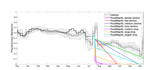
A parameter measuring precautionary behaviour against time. The shaded area reflects how people really did behave, inferred from real data, and the coloured lines show seven different assumptions on how they might change their behaviour after step 4 of the roadmap. Figure taken from the team's paper, used by permission.
The plots below show projections for daily hospital admissions (left for all of 2021, right zoomed in on the time period the projections were made for) for each of the seven behaviour assumptions (coloured curves). The dashed black curve represents the assumptions that there would be an immediate return to pre-COVID mixing between people. The shaded grey area represents the 95% projection intervals for all behaviour assumptions combined into one. Blue dots represent real data points from before the projection was made and yellow dots subsequent real data points.
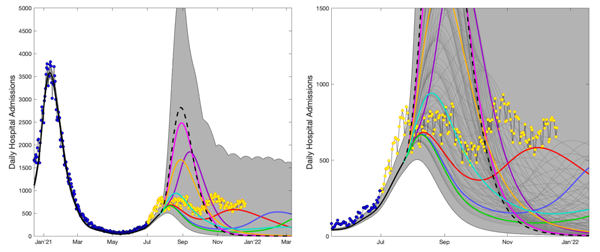
Projections of the step 4b of the roadmap. See the text above for an explanation. Figure taken from the team's paper, used by permission.
Again you can see that the real data are overall in good agreement with the blue, green, cyan and red curves, which correspond to the more cautious behaviour assumptions. From July 2021 onwards, the data indicate a persistent high level of infection with lots of little up and down wobbles — as was observed. This is shown in the close-up (right-hand graph) above, which zooms in on the period from June 2021 to January 2022.
The team suggest that the wobbles were down to a complex interaction of factors. The UEFA European Football Championships in late June and early July led to more mixing between people than had been assumed (increasing infection and so hospital admissions), the pingdemic in late July reduced contacts as people were advised to self-isolate, the effects of the vaccines were beginning wane in some people, more people were immune because they had been infected, and there was more mixing between people generally. This, the researchers say, is why the real data don't cling to any one of the coloured projected curves, but captured different elements of behaviour at different times.
Lessons for the next pandemic
Although all restrictions have now been lifted, COVID is not going to go away and epidemiologist' work on it is far from complete. There are concerns of what is going to happen in autumn and winter and the risk posed by new variants, for example, and we still need to work out who needs further boosters and when.
But COVID aside, are there lessons to be learnt from this pandemic for the next one to come along? "You don't want to take the information from this pandemic and try to directly impose it onto the next one," says Keeling. "This pandemic has been a disease of the elderly and vulnerable. The next one could hit children much harder, or it could affect a different cross-section of the population — there are all sorts of differences that could happen. You can have the models in place and you can have some of the ideas in place, but trying to formulate a set of rules at this point is very dangerous."
One thing that's clear, Keeling says, is that a detailed understanding of controls (such as vaccination or lockdowns) and human behavioural responses is crucial. Another lesson that Keeling thinks should be carried over to the next pandemic concerns the importance of communication — of the science, its limits and uncertainties, and the difficulties involved in modelling a live pandemic as it unfolds.
Background reading
To get an idea of how large-scale epidemiological models work, see The mathematics of diseases and How can maths fight a pandemic?

Matt Keeling
About this article
Matt Keeling is a Professor at the University of Warwick where he is also Director of the Zeeman Institute for Systems Biology & Infectious Disease Epidemiology Research. He also co-leads the JUNIPER modelling consortium.
Marianne Freiberger, Editor of Plus, interviewed Keeling in May 2022.
This article was produced as part of our collaboration with JUNIPER, the Joint UNIversity Pandemic and Epidemic Response modelling consortium.
JUNIPER comprises academics from the universities of Cambridge, Warwick, Bristol, Exeter, Oxford, Manchester, and Lancaster, who are using a range of mathematical and statistical techniques to address pressing question about the control of COVID-19. You can see more content produced with JUNIPER here.