Many of us wait for the daily numbers announcing the state of the pandemic: people testing positive for the first time, hospitalisations, and sadly, deaths in the last 24 hours. But you might have wondered why two numbers are missing from the daily government statistics: how many people currently have COVID-19 and how many new COVID-19 infections there have been in the UK.
See here for all our coverage of the COVID-19 pandemic.
Accurately knowing these numbers, the prevalence and incidence of the disease, would seem to be vital during the pandemic, but these numbers aren't announced alongside other daily statistics. Since we can't possibly test everyone in the population all the time, these numbers are hard to come by. This is why the Office for National Statistics (ONS) started the COVID-19 Infection Survey back in April 2020. The results and analysis of the ONS survey are reported weekly to Government and the public.
The ONS Survey
The ONS survey has provided something no other studies have: it follows the same households over time, with the surveyed households forming a sample that approximately represents the whole population. Initially everyone in the household is tested for COVID-19 every week under supervision, moving on to monthly tests after the first four weeks. This study offers the opportunity to observe, in close to real time, the prevalence and incidence of COVID-19 in these households, whether or not they have symptoms. In this way the ONS survey gives a much clearer picture of state of the pandemic in the community than the data from the NHS Test and Trace programme, which reports one-off tests primarily taken in response to people developing symptoms of COVID-19.
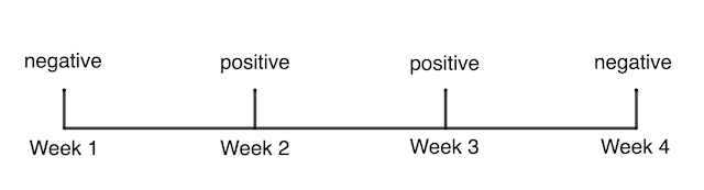
A series of COVID-19 test results for a participant in the ONS survey.
The ONS survey provides a direct measure of prevalence, in a similar way as polling gives a direct measure of people's voting intentions. Indeed, similar methods to those used in polling – called multilevel regression and poststratification (MRP) – are used to extrapolate from the survey sample to the whole population of the UK. (You can read more about the methods used in the ONS Survey here.)
Researchers can also use the data to estimate incidence and duration of infection, using a more indirect route. Suppose a participant tested negative in week 1, positive for COVID-19 in week 2, positive again in week 3, and negative in week 4. This sequence of test results is the thing the ONS survey captures that isn't captured anywhere else: the survey detects the change from a person not having the virus in week 1, to the person testing positive for COVID-19 and then recovering at least two weeks later.
"Given the study design, we don't know exactly when they started and stopped testing positive," says Thomas House, a mathematician from the University of Manchester and a member of the JUNIPER consortium. House is one of the team of academic collaborators with the ONS on this ongoing project. "All you can really do is calculate the earliest and latest times for these events." This is an example of censoring problem in statistics, where all you know about the data is that it is within some observed range.
A number of mathematical approaches can be used to try to manage such censored data but in the case of the ONS survey the first approach used was remarkably straight forward. In essence, the team of academic collaborators on the survey split their bets with something called mid-point imputation. They know the participant was negative on the date tested in week 1, and positive on the date tested in week 2. So they split the time between these known facts in half, and assume the person became infected in the middle of this interval.
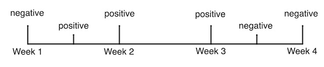
Mid-point imputation assumes that the actual date a participant became infected, or recovered, was half-way between the change in their observed test results.
Duration
The initial weekly phase of the ONS survey didn't just provide information on the state of the pandemic in the UK, it provided vital evidence about the disease itself. In particular, the weekly follow up provided the opportunity to gather data on how long people had the disease, whether or not they had any symptoms.
As you'd expect, this duration isn't a fixed number – some people will only test positive for a few days while some will test positive for weeks. House explains that the best way to mathematically describe the duration of the disease is in terms of the probability that someone still tests positive at some point in time after they first caught the infection. Mathematically we'd write this as function over time (with the variable name  ), giving the conditional probability:
![\[ Dur(T) = P(\mbox{still positive} | \mbox{became positive at time } T=0) \]](/MI/08b4f97077794c483fe659c00b34a8a9/images/img-0002.png) |
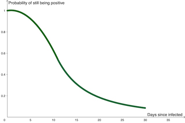
An approximate sketch of the duration function, showing the probability that someone is still positive for COVID-19 as time passes after they were infected.
The ONS survey that gave an opportunity to estimate  directly, in as close as real time as possible. The researchers now have a much clearer mathematical description for the duration of someone's infection with COVID-19.
From prevalence to incidence
The number of new positive tests is reported as part of the daily COVID-19 statistics. This is solid data that gives a reasonably good picture of the growth and ebb of the disease as we monitor the rise and fall of the number of new positive tests. But the reported number of new positive tests doesn't include people who have the disease but have not been tested: perhaps because they don't have symptoms; they are not able to access a test; or they have some other reason not to take a test. Furthermore, the day someone takes the test, and the day the result of that test is reported, will almost certainly not be the first day they had COVID-19. The number of new positive tests reported each day isn't the same as the true incidence of the disease at that time.
"When we were still following up most of the participants weekly we were trying to work out the incidence and prevalence directly," says House. "But that's stopped now as too many people have moved to monthly follow ups." Once you are only testing people monthly you'll miss too many people's initial positive tests to have an accurate measurement of incidence. But the ongoing snapshots of the number positive tests in the sample of the population still provides a good measure of the true prevalence, as does the other significant COVID-19 study, the REACT study, which randomly tests 150,000 people a month.
"Instead we are moving to calculating the incidence from the prevalence, as that's the only way you can do this once you are relying on monthly follow ups," says House. This is possible thanks to a mathematical relationship between the prevalence, incidence and duration of the disease.
The prevalence of the disease includes the people who caught COVID-19 today: which we'll write as a function of time,  , where today is time
  .
.
The prevalence also includes the people who caught the disease yesterday (given by  if we are measuring time in days) who still have the disease today. We know from our discussion of the duration of the disease above that the people who caught the disease 1 day ago will have a probability of
  of still testing positive, so the number of them still testing positive today is
 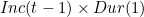 .
.
The prevalence of the disease today also includes the people who caught the disease two days ago who are still testing positive today: given by  . And we can continue with this train of thought to give the prevalence of the disease to be:
![\[ Prev(t) = Inc(t) + Inc(t-1) \times Dur(1) + Inc(t-2) \times Dur(2) + Inc(t-3) \times Dur(3) + \dots \]](/MI/37037b23b6974a6227f6d266808e6689/images/img-0002.png) |
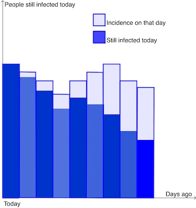
The prevalence of a disease today is the sum of the people who caught the disease today, plus those who caught it yesterday and are still infected today, plus those who caught it two days ago and are still infected today... and so on. The light blue rectangles illustrate the incidence on previous days, and the dark blue rectangles illustrate the proportion of those (given by Inc(t-k) x Dur(k) where k is the number of days ago) who are still infected today.
Statistics are announced every day, but this division of time into day-length steps is quite arbitrary. Mathematically, it can be easier to work with smaller and smaller time steps, and if you take this to the limit you benefit from all the powers of calculus. At this point, rather than daily, or hourly counts, you can describe the prevalence for any point in time  , as an integral over the time,
  , since people caught the disease:
![\[ Prev(t) = \int _{T=0} ^\infty Inc(t-T) Dur(T) \mathsrm {d}T \]](/MI/5a5dd8c4046f3278732ce226ad2da7f4/images/img-0003.png) |
House explains that this approach illustrates some of the innovations mathematicians have had to make, moving from their usual experience of working on a complete data set for a past disease, to dealing with a stream of live data from a disease progressing in real time. "Trying to work out directly in real time the incidence of a disease has never been done before. That's really challenging." Thankfully people like Thomas House and the rest of the researchers working on the team are rising to the challenge.
About this article

Thomas House
Thomas House is Reader in Mathematical Statistics at the Department of Mathematics at the University of Manchester and a member of the JUNIPER modelling consortium and the modelling group SPI-M, and contributes to the Scientific Advisory Group for Emergencies (SAGE).
Rachel Thomas is Editor of Plus.
Thank you to Sarah Walker, Professor of Medical Statistics and Epidemiology at the University of Oxford, for her help with this article. She is one of the team of academic collaborators on the ONS survey.
This article was produced as part of our collaboration with JUNIPER, the Joint UNIversity Pandemic and Epidemic Response modelling consortium. JUNIPER comprises academics from the universities of Cambridge, Warwick, Bristol, Exeter, Oxford, Manchester, and Lancaster, who are using a range of mathematical and statistical techniques to address pressing question about the control of COVID-19. You can see more content produced with JUNIPER here.