
As we all know by now, tests used for medical diagnoses aren't 100% accurate. When you receive a positive test result for a particular disease, there is still a chance that you haven't actually got it, in other words, that you are a false positive.
The probability that you do actually have the disease when you receive a positive test result is called the positive predictive value of the particular test in question. The higher the positive predictive value, the higher the chance you actually have the disease.
The positive predictive value of a test obviously depends on how accurate the test is. But interestingly, it also depends on how many people in the population have the disease in question. The more widespread the disease (the higher its prevalence) the higher the positive predictive value.To illustrate this, imagine that a given test correctly identifies 80% of people who have the disease and that it correctly identifies 99.9% of people who don't have it. (We assume that the test always gives positive or negative as an answer, so there are no inconclusive test results.) Also imagine that 2% of the population have the disease the test was designed for.
If the population consists of 100,000 people, then this means that 2,000 people have the disease and 98,000 don't have it. If everyone were to be tested, then out of the 2,000 who have the disease, 80% would correctly receive a positive test result, so that's 1,600 people. The remaining 400 would be false negatives.
Out of the 98,000 people who don't have the disease, 99.9% would correctly get a negative test result, so that's 97,902 people. The remaining 98 people would be false positives.
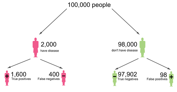
This diagram was adapted from one that appeared in a Plus article article by Mike Pearson and Ian Short.
This means that a total of
1600+98=1698
people receive a positive test result. For a proportion of
1600/1698=0.94
the test result is correct. Therefore, the chance that a person who tested positive actually has the disease is 0.94, which translates to 94%.
Now still imagine that a given test correctly identifies 80% of people who have the disease and that it correctly identifies 99.9% of people who don't have it. But now let's assume that only 0.2% of the population have the disease the test was designed for. If the population consists of 100,000 people, then this means that 200 people have the disease and 99,800 don't have it. Out of the 200 who have the disease, 80% correctly receive a positive test result, so that's 160 people. The remaining 40 are false negatives.
Out of the 99,800 people who don't have the disease, 99.9% correctly get a negative test result, so that's 99,700.2 people. We will round that to the nearest integer, giving 99,700 people. The remaining 100 people are false positives.
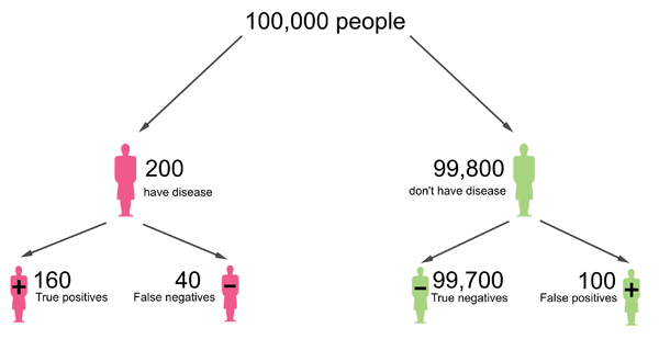
This diagram was adapted from one that appeared in a Plus article article by Mike Pearson and Ian Short. People are rounded to the nearest integer.
This means that a total of
160+100=260
people receive a positive test result. For a proportion of
160/260=0.61
the test result is correct. Therefore, the chance that a person who tested positive actually has the disease is 0.61, which translates to 61%.
So, to summarise, for a prevalence of 2% the positive predictive value in this example is 94%, but for a lower prevalence of 0.2% the positive predictive value is only 61%. This illustrates that the higher the prevalence of a disease, the higher the chance that a positive test result means you actually have the disease.
There is also something called the negative predictive value: that's the chance that someone who has received a negative test result really does not have the disease. For a given test, this value also depends on the prevalence of the disease in the population, but this time the other way around. The higher the prevalence, the lower the negative predictive value. We leave it as an exercise for you to check this is true.
You might also want to read Maths in a minute: False positives and Visualising probabilities.
About this article
This article was produced as part of our collaboration with JUNIPER, the Joint UNIversity Pandemic and Epidemic Response modelling consortium. JUNIPER comprises academics from the universities of Cambridge, Warwick, Bristol, Exeter, Oxford, Manchester, and Lancaster, who are using a range of mathematical and statistical techniques to address pressing question about the control of COVID-19. You can see more content produced with JUNIPER here.

Comments
Another helpful post on this topic
For another helpful post on this topic please see https://blog.ephorie.de/covid-19-false-positive-alarm.