
Probabilities and statistics: they are everywhere, but they are hard to understand and can be counter-intuitive. So what's the best way of communicating them to an audience that doesn't have the time, desire, or background to get stuck into the numbers? Ian Short explores modern visualisation techniques and finds that the right picture really can be worth a thousand words.
Visualising probabilities: an example
What is the probability that a woman who tests positive for breast cancer actually has breast cancer? To pin this question down, let us consider a population in which 1% of women have breast cancer, and a mammography test which has a 90% chance of returning a correct result. That is, if a woman has cancer then there is a 90% chance the test will be positive, and if a woman does not have cancer then there is a 90% chance the test will be negative. Suppose a particular woman tests positive; what is the probability that she has breast cancer? The answer may seem surprising.
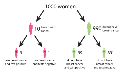
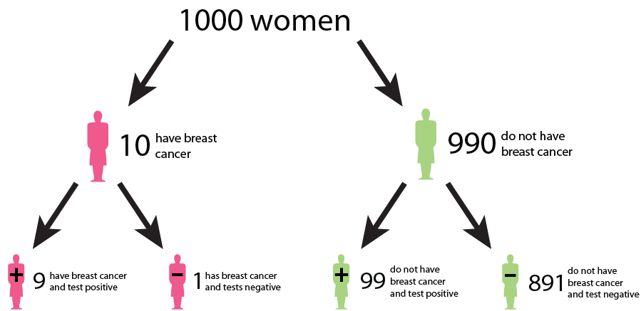
Figure 1: A tree diagram describing the outcomes of a mammography test. (Click here to see a larger version of this image.)
A tree diagram, such as figure 1, can help answer this question. The data used in the tree diagram is from the UK Breast Cancer Screening Programme. Figure 1 begins at the top with 1000 women. The number 1000 is chosen for convenience and simplicity. Moving down, the tree splits in two: 10 women (or 1%) on the left have breast cancer, and 990 women (or 99%) on the right do not have breast cancer. Continuing on, the 10 women with breast cancer split into 9 women (or 90%) who correctly test positive, and 1 woman (or 10%) who incorrectly tests negative. The 990 women without breast cancer split into 99 women (or 10%) who incorrectly test positive, and 891 women (or 90%) who correctly test negative. From the bottom row we see that of the women who test positive, 9 have breast cancer and 99 do not have breast cancer. Therefore the probability that a woman who tests positive for breast cancer actually has breast cancer is 9 in 108, which is roughly an 8% chance.
Why visualise probabilities?
Visualisations like the graph in figure 1 can enliven information, grab people's attention, inspire, and influence. They can summarise data concisely, illuminate hidden patterns, and provide instruction for those with poor numeracy. Many graphics have these features, but those used to represent probabilities may be of particular importance when the information is complex and the circumstances highly significant.
The complex set of probabilities in the mammography test question is explained simply and attractively in figure 1, which guides you through the logic necessary to dissect the problem. This figure has many desirable properties. It is clear and free from clutter. The icons are suggestive, and are labelled with numbers and words. A natural choice of population size, namely 1000, ensures the arithmetic is simple, and all outcomes of the test are considered. Finally, and importantly, the graphic is accompanied by a narrative, which describes how to interpret the data.
Figure 2 is an icon display which illustrates the same information as figure 1, but this time each of the 1000 women is represented by an icon. The women in the box are those that test positive for breast cancer, and the 9 red women in the box are those that test positive and actually do have cancer.
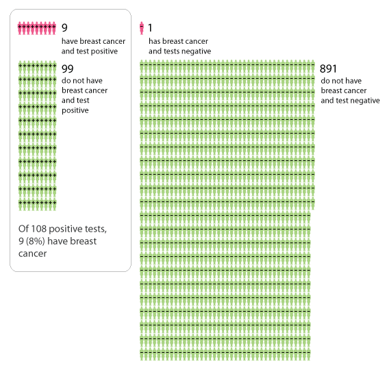
Figure 2: Icon display describing the outcomes of a mammography test.
It is useful to have multiple representations of the same set of probabilities, because different graphic formats appeal to different people. Icon displays such as figure 2 are used increasingly, because they can describe probabilities using numbers that are easy to handle. In the 1920s and 1930s the Austrian philosopher Otto Neurath and his collaborators popularised the use of icons as a means of communicating information. They created a picture language called Isotype, in which multiple identical icons were often used to represent numbers.
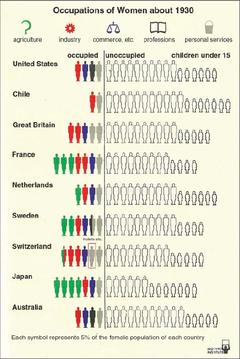
Figure 3: Icon bar chart of women occupations (image from the Isotype Institute).
A graphic from Neurath's school is shown in figure 3. Each row contains twenty women icons, and each icon represents 5% of the population of the corresponding country. The most striking message of the graphic is the large proportion of unemployed women. The data of this image could also be represented in a table of numbers (in fact it would be useful to accompany this graphic by such a table); however, the graphic communicates the statistics with far more force and immediacy than a table. We instantly receive a general impression of the distribution of jobs, even if our mathematics is poor. Other celebrated graphical representations of data include Charles Joseph Minard's flow map of Napoleon's tragic campaign into Russia in 1812 (see the Understanding Uncertainty website for animated versions of the data) and Florence Nightingale's polar area charts (again, see Understanding Uncertainty for an animated version).
Figure 3 is a visualisation of historical data rather than probabilities, but statistical tools such as icon bar charts, block bar charts, and pie charts can certainly be used to communicate probabilities. The stacked bar chart in figure 4 represents the benefits over ten years of taking statins (for a healthy 57 year old man). There are two clearly labelled bars; one represents all possible outcomes for 100 similar men who do not take statins, and the other represents all possible outcomes for 100 similar men who take statins. The key difference between the two bars is the yellow segment in the lower bar, which represents the 3 out of 100 men who take statins and do not suffer a heart attack or stroke, and who would have suffered a heart attack or stroke had they not taken statins.
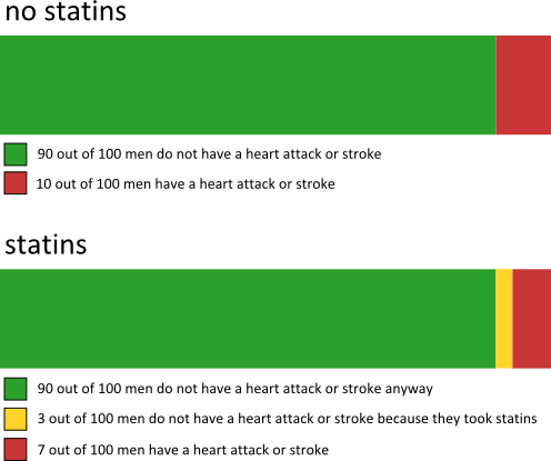
Figure 4: A stacked bar chart with probabilities that a healthy 57 year old man has a heart attack or stroke in the next ten years.
Often the need for graphics increases with the complexity of probabilities. Hurricane Irene recently swept through the east coast of America. When the hurricane was located around the Bahamas, meteorologists ran a computer model to predict its most likely path. The spaghetti plot shown in figure 5 is created by applying the model with several slightly different sets of initial conditions. The graphic indicates that there are multiple possible futures. Specific probabilities are not supplied because the image appeared only briefly in an NBC News bulletin. The message was communicated instantly and brilliantly.
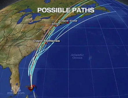
Figure 5: Spaghetti plot of possible hurricane paths (image from NBC News).
What not to do
But not all visualisations are good visualisations. Here's a terrible example:
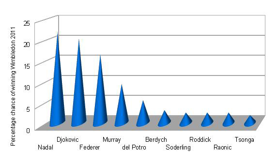
Figure 6: Three-dimensional bar chart of percentage chances of the top ten tennis players winning the men's singles tournament at Wimbledon 2011 (odds taken from William Hill on 1 June 2011).
The chart in figure 6 represents the probabilities (given as percentages) of the top ten male tennis players winning the men's singles tournament at Wimbledon 2011. The probabilities were adapted from odds supplied by William Hill. Djokovic was the eventual winner, and in fact he was the favourite shortly before the tournament began (later in June 2011). It is reasonable to represent these percentages in a bar chart, and this chart is clearly labelled. The information is obscured, however, by the three-dimensional effect, the unnecessary use of cones, and the peculiar perspective. We can summarise these negative features as chart junk. They add useless clutter to what could have been an informative chart. Figure 7 is an improved version of the graph without the chart junk.
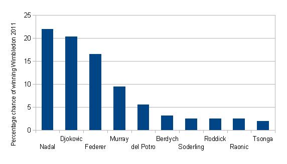
Figure 7: Bar chart of percentage chances of the top ten tennis players winning the men's singles tournament at Wimbledon 2011 (odds taken from William Hill on 1 June 2011).
The case for minimalism in graphics such as figure 7 has been argued strongly by the influential American statistician Edward Tufte. His books, including The Visual Display of Quantitative Information, are highly commended.
The pie chart of figure 8, which is a static part of an impressive interactive display from Kick Off, exhibits probabilities of the outcome of a football match between Liverpool and Manchester United played on 15 October 2011. (The chart was extracted on 8 October 2011.) It is attractive, and appears artificially sophisticated, but it is misleading. The size of each slice, determined by its angle at the centre, represents the probability of a particular score. This is fine, and is the principle on which most pie charts are based. Figure 8 also includes, however, a collection of strongly coloured wedges of varying radii towards the centre of the image. These wedges represent the same probabilities as the slices in which they lie. Unusually, the radius of a wedge, rather than the area of a wedge, is used to measure the probability. This has peculiar implications; for example, compare the wedge for a 1-1 draw (12%) with the wedge for a 0-0 draw (6%). Despite being far larger, the 1-1 wedge represents only twice the probability of a 0-0 wedge. The graphic would be clearer without the inner collection of wedges.
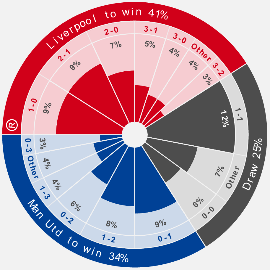
Figure 8. Pie chart with probabilities of outcome of Liverpool versus Manchester United football match on 15 October 2011 (image from Kick Off).
There are other more subtle pitfalls in presenting probabilities, which apply to verbal, numerical, and graphical communication. The audience might have a poor grasp of mathematics, and be confused by fractions and numeric comparisons. They will also have preconceptions and bias that may lead them to act irrationally. Consider for instance the issue of framing, which concerns the way that probabilities are presented. An example of framing is provided by a recent slogan on the London Underground, "99% of young people do not commit crimes", which could alternatively have been phrased "1% of young people commit crimes". When creating a simple bar graph of this statistic you must choose whether your bar should represent the 99% or the 1%, and the choice of framing will influence those who view the graphic. In this case an icon array of 100 icons, with one distinguished icon, is more appropriate, because it includes all possible outcomes, and gives them equal weight. Understanding Uncertainty has an interactive tool that explores framing.
Innovation, infographics, and interactivity
Advances in computing power and the internet have led to an explosion in graphical representations of data, or infographics. Massive quantities of online data are available to the public, who can create visualisations and immediately disseminate them on a huge scale. These visualisations need not be static; they can be dynamic and interactive, which opens up a world of previously inconceivable opportunities (for both harm and benefit). Designers such as Ben Fry and Dave McCandless, and newspapers such as The New York Times and The Guardian, lead the way in visualising data. Protovis and D3 provide tools for creating your own visualisations, and Many Eyes and tableau public generate statistical graphics automatically once they receive data.
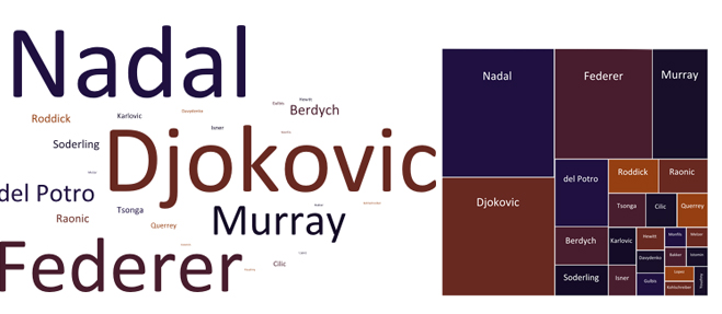
Figure 9: Word cloud (left) and tree map (right) representing the probabilities of the top 24 male tennis players winning the men's singles tournament at Wimbledon 2011.
The data used to generate figure 9 is the same as that used to generate figure 6 (taken from William Hill), except this time we used the top 24 players rather than the top 10. These graphics were created by entering data from William Hill into Many Eyes, and then embellishing the output. The font size of the word cloud is proportional to the chance of a player winning the title. A deficiency of using word clouds in this fashion is that you only see how probabilities of different players compare; you do not see the actual values of probabilities. Also, long words receive more space than short words! In the tree map, the area of a block represents the probability of that player winning. This tree map could be improved by labelling each block with the probability it represents.
Interactive graphics have great potential in the field of visualising probabilities, and visualising data in general. Hans Rosling's now famous Gapminder handles complex data sets beautifully, and it is particularly instructive when accompanied by a narrative. Understanding Uncertainty has a variety of interactive tools for handling probabilities. In general, interactive graphics encourage users to engage with visualisations actively, rather than passively, which helps understanding and retention. Tool-tips, hyperlinks, and other dynamic features can enrich interactive graphics, and help them adapt to user preferences. The American Council on Science and Health has created an interactive tool called Riskometer, shown in figure 10, which includes many of these features. It describes causes of death in the USA, and because the associated probabilities are small, there is a zooming facility, which is illustrated with a magnifying glass.
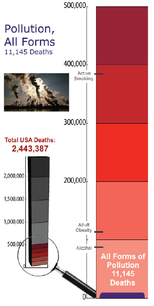
Figure 10: Magnified linear scale comparing deaths from pollution with other causes (image from Riskometer.org).
With these exciting developments in computing and infographics comes huge potential for creativity, and huge potential for junk, and searching the on-line literature you will find plenty of both. There are no hard and fast rules for designing graphics to communicate probabilities, but if you keep the needs and abilities of the audience in mind, present your information clearly without bias, use narratives, and develop through experiment, then your visualisation has a better chance of success.
For more on visualising probabilities, see Visualizing uncertainty about the future, by David Spiegelhalter, Mike Pearson, and Ian Short, published in volume 333 of Science. You can access the paper without subscription to Science by following the links on Understanding Uncertainty.
About the authors

Ian Short
Ian Short is a lecturer in mathematics at the Open University. His mathematical interests include complex analysis, continued fractions, dynamical systems, hyperbolic geometry, and uncertainty.

Mike Pearson
Mike Pearson is a a techno-geek responsible for maths.org sites with interests in communicating maths and stats using visualisations and animations. He was a one-time Plus maintainer, but is now more involved with our sister site NRICH and the Understanding Uncertainty website.