
Data, data, data — 21st century life provides tonnes of it. It's paradise for researchers, or at least it would be if we knew how to make sense of it all. This year's AAAS annual meeting in Vancouver devoted plenty of time to the question of how to understand large amounts of data. And there's one method we particularly liked.
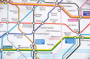
The London Underground map.
It's inspired by the same idea that gave us the London tube map. The reason why even the most bewildered tourist can find their way around the tube network easily is that the map does away with geographical accuracy in favour of clarity. The map retains the general shape of the tube network, the way the lines connect, but it distorts the actual distances between stations and pretends that trains only run in straight lines, horizontally, vertically or inclined at 45 degree angles. That isn't how they run in reality, but it makes the map a lot easier to read. It's a topological map named after an area of maths, topology, which tries to understand objects in terms of their overall shape rather than their precise geometry. It's also known as rubber sheet geometry because you're allowed to stretch and squeeze shapes, as long as you don't tear them.
Maps are great because our brains are good at making sense of pictures. So representing data in a visual form is a good way of understanding it. The question is how. Suppose for example you're an online book seller and you've got customer ratings for your books, which you want to analyse. If you've only got two customers, then you can plot the ratings of each book on a grid with the horizontal axis corresponding to customer A and the vertical axis corresponding to customer B.
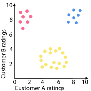
The blue dots represent books that have been rated highly by both customers. Red dots are books that have been ranked poorly by customer A and highly by customer B. The yellow dots form a circular shape, which you might want to investigate for marketing purposes.
You can immediately spot the books that have rated highly by both customers: they are in the top right corner of your plot and you might decide to market them to customers with a similar profile to A and B. Books that have been rated highly by customer B but poorly by customer A are in the top left corner of your plot — perhaps these should only be marketed to customers similar to B. Generally, if your data shows up some kind of shape or pattern, you can spot it immediately and draw the appropriate marketing conclusions from it.
But in reality things are more complicated. You'll probably have thousands of books and customers. Each book now comes, not with a pair of numbers, but with a huge long list containing the rating of each customer or perhaps a blank if a specific customer hasn't rated the book. Now you can't simply plot the data and spot the pattern.
This is where topology comes to the rescue: it gives a neat way of turning shapes into networks. Suppose you've got a wobbly circle as in the figure below. You can cover it by overlapping regions and then draw a dot on a piece of paper for each region. You then connect dots corresponding to overlapping regions by an edge. The network doesn't retain the wobbliness of the shape, that information has been lost, but its topology, the fact that it's circular, is clearly visible. And the great thing is that it doesn't matter what kind of covering you use to make your network. As long as the regions are small enough — the resolution is high enough — the network will draw out the topology of the shape.
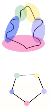
Cover the shape by overlapping regions to get a network.
The idea can be transferred to large data sets. Group your data points, in our case books, into overlapping groups and draw a network in the same way. The question is, according to what criteria should you group the points? The method presented by Gunmar Carlsson at the AAAS meeting involves using a filter function, which is in some way meaningful in the context you're working in, and which projects your data onto a simpler shape which you do know how to cover by overlapping regions.
In our example the filter might be the average rating of each book, which is just a single number. So by working out the average, you've projected your high-dimensional set onto the number line. You can now divide the number line up into overlapping intervals — that's easy to do. This organises your books into overlapping groups: each group has average ratings in the same interval.
But this isn't all. Simply looking at averages loses you quite a bit of information: a book that's been rated by 1000 customers who've all given it a 3 has the same average rating as a book that's been rated by just two customers who gave it a 2 and a 4. But you can recoup some of this information by looking at the data points in each group in more detail. You can cluster the points in each group according to some kind of measure of similarity. For example, you might put two books into the same cluster if the distribution of ratings they get, the number of 1s, and 2s etc, is similar. These individual clusters now give you your network nodes — each node corresponds to books with average ratings in the same range and a similar distribution of rankings. You connect two nodes if the corresponding clusters overlap. And just as the network for our wobbly circle captured its topology, so the network you get will capture aspects of the "shape" of your data set.
Carlsson and his colleagues have applied this technique to a range of situations, including one involving tissue samples taken from breast cancer patients. In this case a data point corresponded to a sample, which came with a long list of information capturing how much the expression levels of different genes deviate from those for normal tissue. The filter function they used gave a number for each sample which measured the overall deviation for all genes taken together, ignoring the exact contributions from individual genes. They then clustered the data in each individual group using a similarity measure that is commonly used when dealing with genetic information.
The network they came up with is shown below. It includes a chain of nodes which corresponds to types of cancer that had never been identified as being related before (marked as c-MYB+ in the figure below). And when they conducted further analyses on these cancers the researchers found that they do indeed have distinct biological characteristics and that there was a 100% survival rate in the patients from which the tissue samples were taken. This gives us clues as to how the nature of a cancer depends on the activity of different genes. No other attempt at analysing the data had spotted this connection.
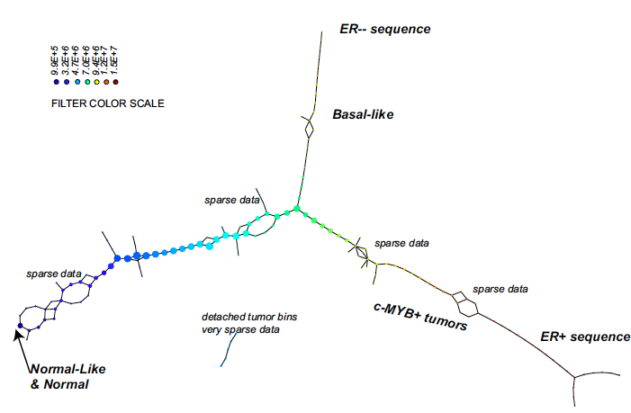
The colours of the nodes represent the average value of the filter function on the corresponding interval. The size of the nodes reflects the number of samples that correspond to each node. The chain of nodes marked c-MYB+ is the subgroup of cancers that had not been identified before. Image from a paper by Carlsson and colleagues which appeared in Proceedings of the National Academy of Sciences.
The researchers didn't do all the analysis by hand. There's a software tool which produces the network for you. You need to give the software a number of inputs: your data, the filter function and a similarity measure with which to do the clustering. And if you choose them well, then your network might reveal information you wouldn't have been able to see otherwise.