
Modelling the spread of disease is a difficult business. Once upon a time diseases could spread only as fast as we could walk or ride a horse. But today our complicated travel patterns mean an epidemic can jump from country to country in a matter of hours when an infected person boards a plane. Epidemiologists use incredibly complex models involving huge amounts of transport, social contact and disease data to predict the spread of diseases. But Dirk Brockmann, a physicist from Northwestern University, thinks we can hide all this complexity and draw a simpler picture of how diseases spread, even in today's complex world.
You can think of the spread of disease as ripples on a pond, says Brockmann in his session on the AAAS conference in Boston last week. Centuries ago the Black Death moved across Europe like a wave front. It's easy to see where that epidemic started by looking at the way it spread, in the same way a child can tell you where the stone landed that caused the ripples in a pond, says Brockmann.
When a disease moves as a wavefront geographically it is easy to say how fast it moves and estimate when the infection will arrive at a partiular location. The wave of Black Death spread across Europe at approximately 6km per day – not surprisingly about the distance a person might cover in the fourteenth century, walking from town to nearest town. But looking at the spread of modern diseases across the world map, it's clear that geographic distance no longer gives a good indication of the arrival time of a disease.
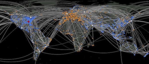
The spread of a hypothetical disease shown on a standard geographic map does not suggest where the disease came from or when it will reach a particular location. The colours represent the prevalence of the infection at each location.(Picture courtesy of Dirk Brockmann)
"The key," Brockmann says, "is to redefine our concept of distance." Thanks to new modes of transport the distance between two points today, say New York and London, is no longer really the geographic distance. Brockmann uses traffic flow (the number of people that move between two locations) to define the effective distance from a location $i$ to a location $j$ as: $$ d_{ij}=1-\log(f_{ij}) $$ where $f_{ij}$ is the fraction of the traffic flow leaving $i$ that travels to $j$. In essence, Brockmann says, the more traffic that flows from one place to another, the closer they are in this new distance scale: "You push New York and London closer together" because a large proportion of the traffic flow from New York travels by plane to London.
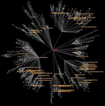
A radial map showing the effective distances of airports from the Cypriate town of Paphos (Picture courtesy of Dirk Brockmann)
Brockmann can then draw a new map (technically known as a shortest path tree) using this new effective distance, with the city of origin at the centre and the other locations radiating outward depending on their effective distance. And if you watch the spread of a disease on this new map centred on the outbreak origin, the disease moves as a series of concentric circles spreading out just like ripples on a pond. (Watch a movie of how a disease spreads on a geographic and radial map.)
If you know where the pandemic started you can calculate the speed of the wave and predict exactly when it will hit other locations. "These new techniques predict with high confidence when a pandemic arrives at any point on the map, if the outbreak location is known," says Brockmann.
Sometimes the problem is that you don't know where the pandemic started. Brockmann is using these same techniques to identify the source of E. Coli infections in Germany in 2011. Plotting the locations that have already been infected on a geographic map paints a pretty confusing picture. But redrawing this snapshot on the new radial maps for every possible origin suddenly reveals the true origin of the outbreak: the radial map with the most concentric rings of infected locations.
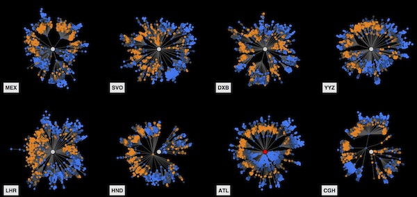
The spread of the hypothetical disease on all possible radial maps drawn using the effective distance. The source of the epidemic is the map with the most concentric spread of infection sites. (Picture courtesy of Dirk Brockmann)
Not only is Brockmann using this technique to predict and model the spread of diseases, it can also be used to understand the spread of culture and technology. He's currently working with archeologists to map the evidence for neolithic farming to uncover the first spark of agriculture. We may now move in far more complicated ways than farmers in neolithic times, but this new technique hides the complexity and makes all these phenomena appear as ripples in a pond.