

In this day and age of the internet, where anyone can post anything, it is often difficult to know what is true and what is not. One person claims one thing, while another states the exact opposite. Who to believe among all this (sometimes deliberate) confusion?

Have volcanic eruptions become more frequent? Find out with a little bit of maths.
The upside, also thanks to the internet, is that you don't need to be a professional scientist to find out at least some of the truth for yourself. With the increasing availability of public online databases and easy-to-use software, "citizen science" can go a long way at countering unsubstantiated claims.
Take, for example, the confusion surrounding the topic of recent earth activity, in particular earthquakes, tropical storms, and volcanic eruptions. Many claims are going around that all of these have drastically increased over the past several years. However, few of these claims include supporting evidence, or if they do the statistics are often presented in a biased or distorted way to make the claims seem true.
In this article I will present some simple statistical analyses to show how any person with a computer and an internet connection can decide for themselves whether to believe such claims or not. All it takes is some public databases and a little bit of basic maths...
Earthquakes
To start with earthquakes, probably the most complete and accurate database is maintained by the US Geological Survey (USGS). This database is publicly available on the internet, and data can be downloaded for any range of magnitudes, time period, or geographic region.
The downloaded data can then be opened and analysed in any spreadsheet program, such as OpenOffice Calc. Even better software for doing statistics is the R program. This software requires a little more effort to learn how to use it properly, but it provides very nice plotting facilities for visualising your data and statistical results. Alternatively, you can use gnuplot for making quick and easy plots. All these programs are available for free and run on all platforms (Windows, MacOS, and Linux). I used a combination of R for doing the statistics and gnuplot for plotting the results.
From the USGS database I downloaded all earthquakes of magnitude 5.0 or larger (M5+), from 1 January 1996 until 31 December 2016, worldwide. The reason I chose M5+ is that those are potentially damaging. Then I used the R program to group these into monthly counts (i.e., counting the total number of earthquakes in each calendar month), and to calculate a 12-month running average. A running average is an average that is calculated over a subsequence (or "window") of the data, and then "sliding" this window along the entire data sequence. In this case, the running average is calculated over the past 12 months, counting backwards from the current month while moving forward in time. For example, the running average for the month of April 2014 is the average over the 12-month window starting from May 2013 and ending at April 2014.
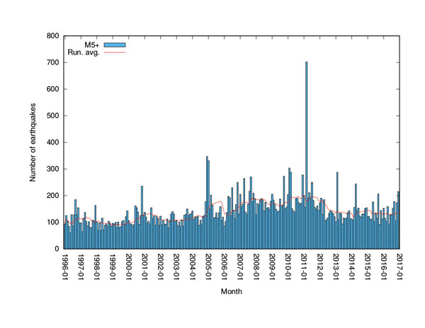
Figure 1: Monthly number of earthquakes. The total number of earthquakes per month since January 1996 (blue bars), and a 12-month running average (red line).
The results are shown in figure 1, where the blue bars indicate the monthly counts and the red line the 12-month running average. Various observations can be made from this plot. First, and most obvious, there is the large spike in March 2011. This is due to the M9.0 earthquake off the coast of Japan on 11 March 2011 (which triggered a tsunami that caused widespread damage and casualties). This extremely violent earthquake caused many large aftershocks, generating the unusually high number (just over 700) of M5+ earthquakes for that month. Since this event is an exception, the monthly count for March 2011 was not included in the running average calculations.
The second striking observation is that, even though there seems to have been an increasing trend in number of earthquakes from early 2000 onwards (indicated by the red line), after the March 2011 event there was actually a clear drop in the number of earthquakes, which seems to have leveled off since then. In fact, the number of earthquakes in the most recent months is very similar to what is was more than 10 years ago. Perhaps the tectonic pressure that had been building up over the years before 2011 was released sufficiently by the large M9.0 earthquake that everything has "calmed down" again. This gradual increase followed by a significant drop is even more clearly visible when the earthquakes are grouped into yearly counts, as is shown in Figure 2.
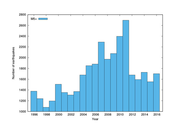
Figure 2: Yearly number of earthquakes. The total number of earthquakes per year since 1996 (blue bars). Note that the vertical axis starts at 1000 instead of zero, so the increase looks more exagerated than in Figure 1 (one of those little tricks to "manipulate" statistics).
So, in conclusion, even though there indeed seems to have been a clear increase in the number of M5+ earthquakes since around 2000, this number dropped significantly after the March 2011 event, and is now back at the level it was more than 10 years ago. Moreover, this initial increase is completely absent when considering only M6+ earthquakes. If you don't believe this, you now know how to verify (or refute) this for yourself, rather than simply accepting what anyone else claims!
Tropical storms
Next up are hurricanes. Data on tropical storms in both the Atlantic and eastern Pacific can be obtained from the National Hurricane Center. Monthly storm reports since 1999 are available under the Tropical Cyclone Monthly Summary Archive section. In particular, the final report of each year contains a full summary of all storms for that particular year, including data on maximum sustained winds (in MPH). Storms with maximum sustained winds of at least 40MPH (which are considered to be tropical storms or worse) are included in the analysis here.
Figure 3 presents the results of collecting this data, showing the total number of storms in each year (Atlantic and eastern Pacific combined; purple line), their average strength (in MPH; green line), and the maximum observed strength in that year (in MPH; red line). Although there was a record-breaking storm with maximum sustained winds of more than 200MPH in 2015 (Hurricane Patricia which developed off the coast of Mexico in October 2015), there is no clear trend visible in the data, let alone an obvious increase.
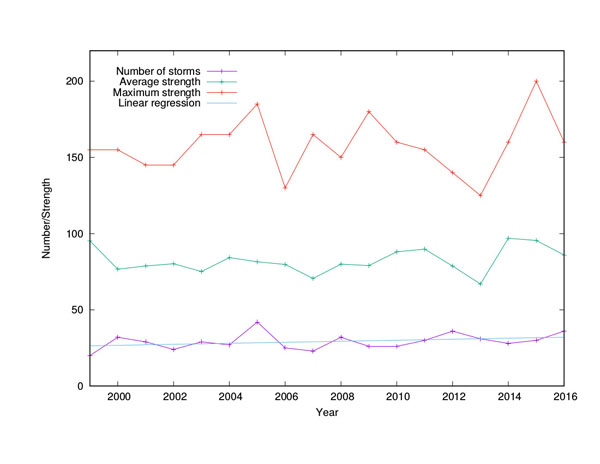
Figure 3: Yearly tropical storms. The total number, average strength, and maximum strength of tropical storms per year since 1999, combined over the Atlantic and eastern Pacific. The blue line indicates the result of a linear regression on the number of storms over time.
To test this lack of a trend statistically, a linear regression can be performed on the data. Briefly, in this context a linear regression tries to fit a straight line to the given data, and calculates several statistics indicating how well the line fits the data and whether the slope of the line is significantly different from zero (i.e., whether there is a real trend or not). See here for a more detailed explanation of this type of statistical analysis and how to interpret the statistics (such as R2 and p-values).
Performing a linear regression on the number of tropical storms against time (years), the fit is very poor: R2=0.11. The result of this regression is shown in Figure 3 by the blue line, but it explains only just over 10% of the variance in the data. Moreover, the p-value for testing the null hypothesis that the slope of the regression is equal to zero is 0.172, so there is far from enough statistical evidence to reject this hypothesis, even at a more "forgiving" significance level of 0.05 (or 5%). In other words, there is no statistical justification to claim that there is an increasing trend in the number of tropical storms over the past (almost) 20 years.
Volcanic eruptions
Finally, we'll have a look at volcanoes. An online database of volcanic eruptions is provided by the Smithsonian Institution. I downloaded data for the years 1976-2016, which is presented as yearly counts in Figure 4.
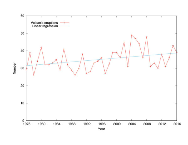
Figure 4: Yearly volcanic eruptions. The total number of volcanic eruptions per year since 1976, worldwide (red line). The blue line indicates the result of a linear regression on the number of eruptions over time.
Performing a linear regression on the number of eruptions against time, the fit is again very poor: R2=0.12. However, in this case the linear relationship, represented by the blue line in Figure 4, does seem to have a clear positive slope. The p-value for testing the null hypothesis that the slope of the regression is equal to zero is 0.024. This value is somewhat in the grey area, but still above the standard significance level of 0.01. This, together with the poor fit of the linear model, and the fact that the number of eruptions over the past eight years is (on average) lower than in the previous eight-year period (as is clear from Figure 4), suggests that there is little statistical evidence for an obvious increase in the number of volcanic eruptions over the past 40 years.
Some afterthoughts...
The above analyses of publicly available data does not provide much statistical support for claims of a significant recent increase in seismic, atmospheric, or volcanic activity on our planet. Even though there was a clear increase in M5+ earthquakes in the build-up to March 2011, this was followed by a significant decrease since then. Furthermore, any clear trend (in either direction) is completely absent in the number of M6+ earthquakes and tropical storms. The number of volcanic eruptions does show a slight positive trend, but this can hardly be considered statistically significant.

The more people are affected by a storm, the more likely it is to be recorded and reported.
So, how come such claims exist (and persist) in the first place? Or, if they are somehow true after all, why is there an apparent lack of statistical evidence? I can imagine several possible answers to these questions.
- Lack of longer-term data: One could argue that to see real trends, we need data even further back in time. However, given that the majority of claims about an increase in earth activity seem to specifically emphasise recent years (2012 seems to be a particularly popular date), data for the past two to four decades should still clearly show the claimed increase.
- Incomplete or unreliable data: Related to this, older data might not be reliable or complete enough. For example, on the USGS website it is clearly stated that there were no machine-readable earthquake records available for the years before 1980. This older data literally had to be scanned in from paper documents. In other words, possibly increasing trends over longer time scales may simply be an artefact of missing data.
- Increase in population size: The world's population has increased exponentially over the past few decades. As a consequence, urban areas have grown rapidly, both in size and number. Even if the frequency and magnitude of natural disasters like earthquakes, hurricanes, and volcanic eruptions has remained the same, the average number of affected people per event will inevitably have increased, perhaps giving the illusion that things have become worse, or more frequent.
- Increase in news reporting: On a similar note, news reporting has increased drastically as well over the past years or decades. Anytime anything happens anywhere, we hear or read about it in the news. However, this increase in the number and extent of news reports on natural incidents does not necessary reflect an actual increase in such events, but may also simply give the illusion of an increased frequency.
I hope the simple analyses in this article have provided some examples of how we can all be "citizen scientists" in pursuit of truth. With the increasing availability of online public databases and free software, it has become possible for anyone with access to a computer and the internet to find out for themselves whether certain claims are true or not. And of course a little bit of basic mathematics is very helpful too. As the famous evolutionary biologist J. B. S. Haldane once said: "An ounce of algebra is worth a ton of verbal argument."
About the author

Wim Hordijk is a computer scientist currently on a fellowship at the Konrad Lorenz Institute in Klosterneuburg, Austria. He has worked on many research and computing projects all over the world, mostly focusing on questions related to evolution and the origin of life. More information about his research can be found on his website.