
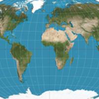
When you think of the Earth in geographical terms the picture that probably first springs to mind is the Mercator projection, named after the 16th century by the Flemish cartographer Gerardus Mercator.
The Mercator projection. Image: Daniel R. Strebe, CC BY-SA 3.0
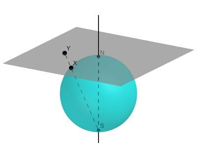
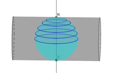
The basic idea behind this projection is to put the Earth (or better a shrunk version of the Earth) into a vertical cylinder, touching at the equator and with the North pole pointing straight up. Given any point x on the Earth you then draw the line that connects x to the centre of the Earth. Extend that line until it hits the cylinder at some point y — that point y is the projection of your point x. Using that technique you can trace the outlines of continents and countries on the cylinder, which you can then cut open and unroll into a flat sheet.
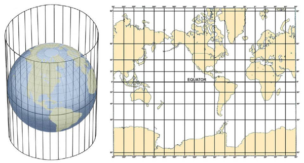
A cylindrical projection. Imagine a light bulb at the centre of the Earth. Continents and islands will project shadows onto the cylinder, which can then be cut open and unrolled into a flat sheet. Image courtesy NOAA.
A problem arises, however, as you near the poles. The projected points move higher and higher up the cylinder as you converge on the North pole and further and further down the cylinder as you approach the South pole. To project the whole Earth you'd need a cylinder that is infinitely long. The two poles themselves don't appear on the cylinder at all: the line that connects them to the centre of the Earth is parallel to the sides of the cylinder and therefore never meets it.
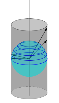
Points near the North pole (e.g. the two points on the right) are projected much higher up than points near the equator (e.g. the two points on the left). This diagram also indicates the distortion that happens as you move closer to the poles.
Mercator's projection is a variation of this cylindrical projection, which ensures that angles are represented faithfully on the map (see here for more detail on the maths of the projection). The problem with the poles still applies, however, and it's for this reason that the Mercator projection doesn't contain them and their immediate surroundings.
The great advantage of Mercator's projection is that lines of constant compass bearing (eg a line traced out by moving due East) correspond to straight lines on the map. This means that if you want to sail from A to B, you only need to draw a straight line between the two on the map. The angle the line makes with the equator (or any line of latitude) tells you your North-South direction and its relation to the Greenwich meridian tells you your East-West direction. You then head off in the direction thus found, using your compass as a guide. As long as you keep the compass needle fixed and don't hit any islands and continents along the way, you will get there.
Unfair distortion
The disadvantage of the Mercator projection is that, as a direct result of the cylinder technique, distances near the poles are stretched, making places near the poles appear much larger than they actually are. On the standard projection Greenland appears to be larger than Africa, when in reality Africa is over 14 times bigger! Politically, this has awkward consequences. Europe and North America happen to sit far enough North of the equator to benefit from the distortion. They appears far bigger in relation to the belt surrounding the equator than they are in reality, thus adding cartographical discrimination to racial, cultural and economic discrimination.
Generally, no projection of the Earth onto a 2D map is 100% accurate. The only way to represent the surface of the spherical Earth on a flat sheet of paper is to introduce distortion. You can convince yourself of this by wrestling an orange out of its skin, keeping the skin in a single piece. When you put the skin down, it will naturally retain its rounded shape. Any attempt to flatten it will either break it or stretch and squeeze it in some direction.
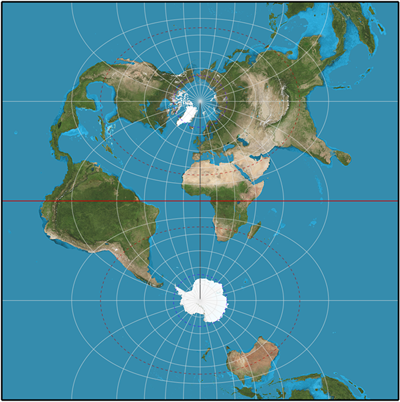
Another nice example of the unavoidable distortion comes from the stereographic projection: imagine balancing a stiff piece of paper on the North pole so that it's perpendicular to the North-South axis of the Earth.
A stereographic projection of a sphere onto a 2D plane.
You can then draw straight lines from the South pole through any point x on the Earth, and the projection of that point x is then the point y at which the straight line meets the paper. This projection preserves angles, and is great for exploring the Arctic, but becomes more and more distorted as you move towards the South pole. (You could also have the paper touch the Earth at any other point to get a map of the region surrounding that point.)
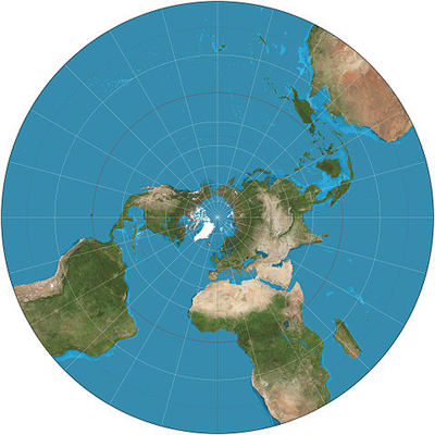
The stereographic projection. Image: Strebe, CC BY-SA 3.0
There are also projections which attempt to minimise distortion. One is the Winkel triple projection. It averages the coordinates from two other projections, the Aitoff projection and the equirectangular projection, with the aim of minimising distortion in distance, direction, and area.
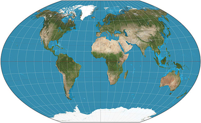
The Winkel triple projection. Image: Strebe, CC BY-SA 3.0
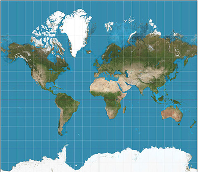
Another well-known map that is often used in contrast to Mercator's, is the Gall-Peters projection. It represents the relative size of areas faithfully — you'll be surprised how small Europe really is — but it greatly distorts shapes. Near the equator shapes are squeezed horizontally and stretched vertically, with the opposite happening near the poles. Continents that cross the equator appear long and thin, which is why the projection has been compared to a washing line on which countries have been hung out to dry.
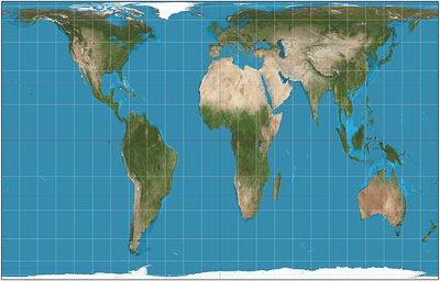
The Gall-Peters projection. Image: Strebe, CC BY-SA 3.0
Going back to the Mercator projection we started with, it's fun to wrap a cylinder around the Earth in a different way, for example turning the cylinder by 90 degrees.
You then get the transverse Mercator projection, which includes both poles and makes the world look very different to what we are used to.
The transverse Mercator projection.
This was just a very short and superficial excursion into the fascinating land of map projections. It's well worth a deeper exploration — if you have a favourite projection you would like to share, send us an email!