At the very start of the COVID-19 pandemic many of us felt we were all pulling together. We stayed home to protect others as much as protect ourselves, helped vulnerable friends and neighbours as best as we could, and waited together with bated breath.
It soon became clear, though, that the disease amplified the differences between us. Those from less advantaged backgrounds recorded more infections and died in greater numbers, and differences also emerged between ethnic groups.
Unequal infections
The data make this abundantly clear. The plot below shows positive test results that were reported over time, split up into ten groups using the index of multiple deprivation — that's a way of measuring how disadvantaged a person is, taking account of a number of factors from income to access to housing and services. The index is defined by the Ministry of Housing, Communities and Local Government.
The dark blue line corresponds to the most deprived tenth of the population, the light blue line to the most advantaged tenth, and the other colours to classes in-between, as shown in the key on the right of the plot. See the caption for more information on the data.
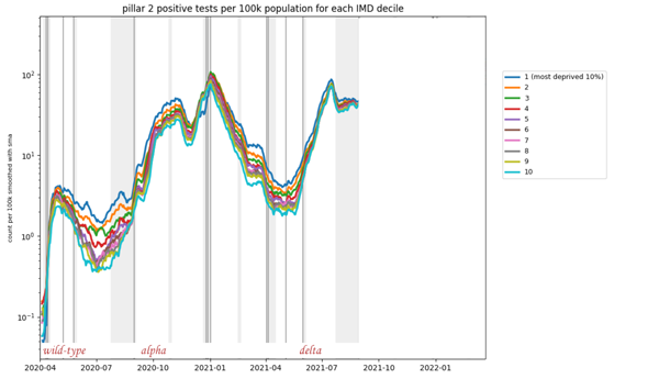
The plot shows results of so-called pillar 2 tests (tests that were not taken in hospitals or by health care staff, but voluntarily by people in the community) per 100,000 people with data divided into ten groups using the multiple index of deprivation (IMD). A positive test was allocated to an IMD group based on the Lower level super output area (a small geographical area) of the home address of the person who tested positive. The data is displayed on a log scale. The plot appeared in Alison Hale's talk at a Newton Gateway event (see below), used by permission. The underlying data comes from the UK Health Security Agency, but is not publicly available.
It's remarkable that the ordering of curves almost exactly reflects the ordering of the deprivation classes at almost all times from April 2020 to July 2021 — the most deprived tenth (dark blue) reported most positive test results, followed by the second most deprived (orange), then the third most deprived (green) and so on, all the way to the least deprived tenth represented by the bottom curve (light blue).
Unequal deaths
As for people dying, differences are also stark. The graph below indicates how the total number of deaths grew over time in England, from the beginning to June of 2020, for each of the ten deprivation groups described above: dark pink stands for most deprived tenth and dark green for least deprived.
The two darkest pink lines stay firmly on top for the entire period, while the two darkest green lines stay near the bottom: there were more deaths among people from the most deprived groups compared to those from the least deprived groups. The underlying data comes from the Office for National Statistics (ONS), see the caption for more information on the figure.
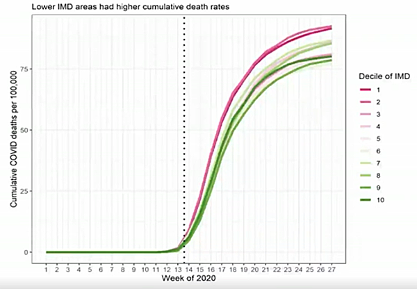
This plot indicates the number of cumulative deaths per 100,000 people in England, with the population divided into ten equal groups according to the multiple index of deprivation (IMD) allocated to the area they live in. Dark pink corresponds to the most deprived tenth and dark green to the least deprived tenth. This figure appeared in Clare Bambra's talk at a Newton Gateway event, used by permission. To find out more about the plot and underlying ONS data, see this paper by Clare Bambra and colleagues.
As far as differences between ethnic groups are concerned, a report released by the ONS in May 2021 makes for sobering reading. Between January 2020 and March 2021 the rate of death involving COVID-19 was highest for the Black African group: for males it was a full 3.7 times higher than for the White British group, and for females it was 2.6 higher than for the White British group.
This was followed by the Bangladeshi ethnic group (3 times higher for males, 1.9 higher for females), then the Black Caribbean ethnic group (2.7 times higher for males, 1.8 higher for females) and the Pakistani ethnic group (2.2 higher for males, 2 higher for females for females).
Unequal vaccinations
Finally, there are also marked differences in the number of people who have gone and got the vaccine. For example, data from the ONS for England shows that by March 2022 only around 57% of men 18 years and over in the most deprived fifth of the population had received three doses of the vaccine. This is compared to 81.5% in the least deprived fifth.
See here for all our coverage of the COVID-19 pandemic.
In terms of ethnicity, ONS data for England shows that the largest proportion of people receiving three vaccine doses was among White British (76%) and the lowest proportion was among the Black Caribbean (38%), Black African (45%) and Pakistani (45%) ethnic groups.
What are the causes?
There no easy answer to this question that covers all the bases. Indeed, the socio-economic factors that drive the inequalities were the subject of a recent virtual research meeting organised by the Newton Gateway to Mathematics in collaboration with the JUNIPER modelling consortium and the RAMP continuity network. The meeting comprised a range of experts, from disease modellers to representatives from the Department of Health and Social Care and the Welsh government. The graphs above were shown in presentations given at the meeting.
There are some causes that appear relatively obvious once you have given the issue some thought. "At the beginning of the pandemic the white collar workers were working from home, so they had fewer contacts than they would normally have," says Alison Hale, an epidemiologist at the University of Lancaster and JUNIPER member, who organised the Newton Gateway meeting. "But then we had a lot of people in lower paid jobs who weren't furloughed — care home staff, nurses, admin assistants in hospitals, supermarket workers, people who were keeping things going, who still had a lot of contacts. And infectious diseases like COVID-19 spread through contacts, of course."
Looking deeper into the data confirms that occupation appears to be crucial. The following chart measures deaths registered in England and Wales broken up by occupation for both men and women. The bars extending furthest to the right — representing the occupation types with highest mortality rates —correspond to jobs that are likely to come with low pay, for example in the care and leisure sectors.
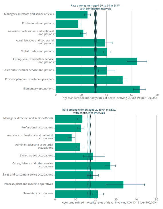
The plots indicate the number of deaths per 100,000 in England and Wales involving COVID-19, split up by type of occupation for the period March 9 2020 to December 28 2020, for men and women. The figures are taken from a report published by a subgroup of the Scientific Advisory Group for Emergencies (SAGE) in February 2021. See the report for more details on the plots and the data.
Living conditions too are likely to play an important role. Crowded housing, more common amongst the more disadvantaged groups, means that someone who has caught the disease is more likely to pass it on. The risk to a busy household, or even a crowded neighbourhood, is amplified if more than one of its members works in an occupation that puts them at higher risk.
Compounding all this is the fact that chronic health conditions, such as a group of lung conditions that cause breathing difficulties known as COPD, are more prevalent in more disadvantaged groups — see, for example, this study published in 2013. Such underlying conditions make it more likely for a person to become very sick with COVID-19, or even die of it.
Taken together, these factors — occupation, living conditions, underlying health conditions — offer plausible explanations for some of the charts above. Other inequalities are harder to explain. Differences between ethnic groups and in the uptake of vaccines are among those. They are probably down to a complex combination of factors, from deprivation to cultural differences that can create barriers when trying to access services and health care (see, for example, this document on mortality differences between ethnic groups published by the Scientific Advisory Group for Emergencies).
The syndemic pandemic
What we see emerging here is the picture of a syndemic. The term was coined in the 1990s by the anthropologist and clinician Merrill Singer. "Singer talked about the interacting risk factors around urban violence, HIV and drug use in America's cities," said social scientist Clare Bambra in her fascinating talk at the Newton Gateway event. "At the time they were being studied very much as separate issues, and Springer argued they needed to be looked at as interacting epidemics."
In a general sense the idea behind the word syndemic is that, to uncover how a disease might affect a population of people, we need to understand much more than the actual disease. "Pre-existing health conditions, socio-economic factors and, if relevant, environmental factors should all be accounted for when analysing and evaluating the data and trends of any infectious disease," says Hale.
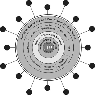
A schematic of a syndemic. Figure taken from The COVID-19 pandemic and health inequalities, co-authored by Clare Bambra. Used by permission.
With this bigger picture in mind, even surprising trends can become less puzzling. An example comes from the first chart in this article, which shows positive tests recorded over time, separated by levels of deprivation. The chart only went up to summer 2021. When you continue it through into 2022, however, something astonishing happens: the curves swap places.
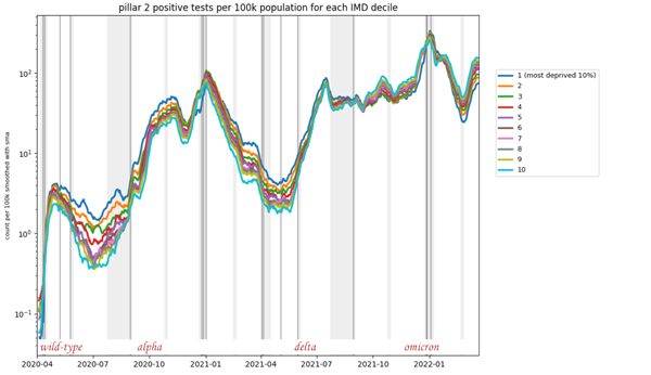
The plot shows results of so-called pillar 2 tests (tests that were not taken in hospitals or by health care staff, but voluntarily by people in the community) per 100,000 people with data divided into ten groups using the multiple index of deprivation (IMD). (This plot was shown at the start of the article - see here for full details of this figure.)
The curve representing the least deprived group moves to the top after the summer of 2021 and the curve representing the most deprived group moves to the bottom. In fact, the inversion seems to be complete with all the other coloured lines now appearing in almost reverse order.
If you take these data at face value, then you deduce that those in the most deprived groups really did catch less COVID after summer 2021 than those in the least deprived groups. A reason for this might be that the most deprived groups had borne the brunt of the disease earlier, and by summer 2021 had acquired enough natural immunity through those prior infections to record fewer cases.
If, however, you take account of people's wider circumstances, then another reason suggests itself. As the bulk of the population started going to work again in July 2021, those whose jobs wouldn't pay if they didn't turn up had a strong incentive not to test, even if they suspected they had caught the disease. Those who could comfortably stay at home, however, could continue to be diligent. When there's little support for those who self-isolate, adherence to the rules can become a luxury.
Why do we care?
It'll take much more unpicking of the data to figure out what exactly was behind the switch, and maybe we will never be sure. Generally, though, it's important to try and understand as much of the syndemic picture as possible. The COVID-19 pandemic is not yet over, and it's unlikely to be the last public health emergency caused by an infectious disease. A good understanding of inequalities can help inform the interventions to be put in place. "If we can pick up where the most vulnerable parts of society are, we may be able to give better support," says Hale.
The recent event at the Newton Gateway to Mathematics is part of a general effort to reveal the causes of inequalities related to COVID-19. The reason it took place at a mathematics institute is that clever statistical detective work is needed to turn speculation into solid conclusions.
In theory, it is also possible to include socio-economic factors in the mathematical models that were so vital in informing policy on COVID-19. Conceptually, these models divide the population into groups — according to age, geographical location, or vaccination status, for example — and then simulate how people from different groups flow through the various disease stages: from being healthy but susceptible, to becoming infected and recovering, or taking a turn for the worse and going to hospital, to potentially dying (see here to find out more about the models). Each group has its own rates of passing from one disease state to another, depending on their risk of catching the disease, how vulnerable they are to becoming very sick, and so on.
If we understand the rates for the different socio-economic groups, then these could also be included in the models. The general blueprint would in theory work for any infectious disease (though the specific parameters would differ, of course) "Infectious disease models are very general," says Hale. "A general mathematical model doesn't care what disease you are dealing with."
The point of including socio-economic factors in the models is that the models' projections would then flag up which groups might be hardest hit by a disease. Combined with good local knowledge about the groups involved, this would help with developing targeted interventions to protect them — whether it's supplying them with protective gear, supporting them when they need to isolate, or supplying information through channels they feel they can trust.
We are still at the beginning of understanding all the social inequalities of COVID-19, or indeed of other pandemics that have happened in the past — the Spanish flu pandemic of 1918 and the swine flu outbreak of 2009, for example, which displayed similar differences between socio-economic groups.
What is clear is that the effort will require the expertise of people from across a range of disciplines. "We need to mould together epidemiology, mathematical modelling, and the social sciences," says Hale. "They need to be working well together to effectively inform policy." To address those inequalities we do need to pull together.
About this article
Alison Hale is an epidemiologist at Lancaster University. She was interviewed by Marianne Freiberger, Editor of Plus, in May 2022.
This article was informed by presentations given at the Socio-Economic Determinants of Coronavirus in the UK an event organised by the Newton Gateway to Mathematics in collaboration with the JUNIPER modelling consortium and the RAMP continuity network.
This article was produced as part of our collaborations with JUNIPER, the Joint UNIversity Pandemic and Epidemic Response modelling consortium, and the Isaac Newton Institute for Mathematical Sciences (INI).
JUNIPER comprises academics from the universities of Cambridge, Warwick, Bristol, Exeter, Oxford, Manchester, and Lancaster, who are using a range of mathematical and statistical techniques to address pressing question about the control of COVID-19. You can see more content produced with JUNIPER here.
The INI is an international research centre and our neighbour here on the University of Cambridge's maths campus. It attracts leading mathematical scientists from all over the world, and is open to all. Visit www.newton.ac.uk to find out more.