
Cosmic sound
How is it possible to pick out the length scales that are important in the cosmic microwave background, as described in Cosmic peaks? The answer lies in one of the most important mathematical tool of them all.
The maths of sound
When you record a sound, such as someone playing a particular note on a recorder, on a device that shows you the corresponding waveform, you'll find that this waveform isn't a nice and regular sinusoidal wave. That's because the recorder can't produce a pure note: it'll produce all its harmonics as well. However, one of the most beautiful gifts that nature and mathematics have given us is the ability to decompose any waveform, no matter how rugged, into component sinusoidal waves. The type of maths used to do this is called Fourier analysis. It's obviously useful in sound processing, but importantly for us, it can also be used on images.
The colours in the CMB picture represent differences in temperature. You can imagine turning such a picture into a landscape with mountains and valleys: the higher, or lower, the temperature at a point, the higher, or lower, the point's elevation. The result will be a rugged terrain, like the one shown below (which doesn't come from the CMB, but was created by us for illustration). The colours reflect the temperature, from red for hot to blue for cold.
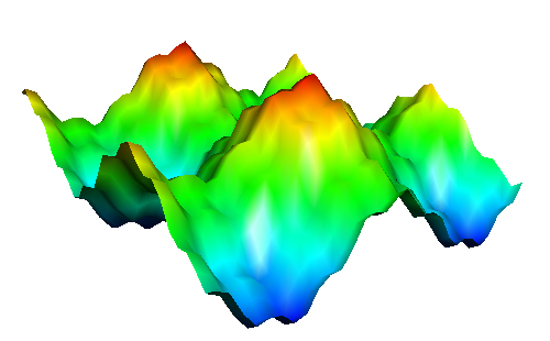
Figure 1: A rugged landscape.
It turns out that this landscape is the sum of four perfectly regular sinusoidal waves, which you can pick out using Fourier analysis. The four images below show these waves. They are described by the mathematical formulae $f(x,y)=sin(x)$, $g(x,y)=cos(y)$, $h(x,y)=0.2sin(5x)$ and $k(x,y)=0.2cos(5y)$.
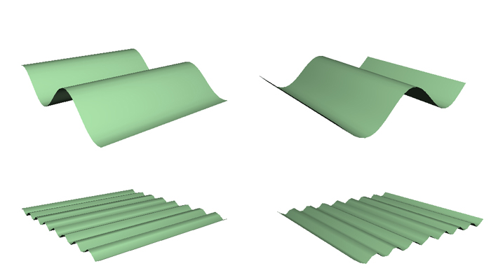
Figure 2: Clockwise from top left: sin(x), cos(y), 0.2cos(5y), 0.2sin(5x). The top two waves have a longer wavelength than the bottom two because the distance between successive peaks is larger.
Here's what happens when you add those functions up, one by one: from $sin(x)$ to $sin(x)+cos(y)$, then $sin(x)+cos(y) +0.2sin(5x)$ and finally to $sin(x)+cos(y) +0.2sin(5x)+0.1cos(5y).$
The result is our original landscape from figure 1. As you'd expect, the finer features of our rugged landscape, the sharp peaks and narrow troughs, come from the component waves with shorter wavelengths, that is, those with lots of ripples ($sin(5x)$ and $cos(5y)$). The larger features, big bumps and wide valleys, come from the component waves with longer wavelengths ($sin(x)$ and $cos(y)$).
Such an analysis works for any temperature map, not just the one we've artificially created for the example. In particular, something very similar works for the CMB map (although the CMB map really lives on a sphere and not on the plane; the oval map is just a projection of this sphere onto the plane.) Once you have decomposed the image into component waves, you can see which wavelengths contributes most. This information is summarised in the power spectrum, as shown below. To find out more, and to find out what the power spectrum tells us about the Universe, see Cosmic peaks.
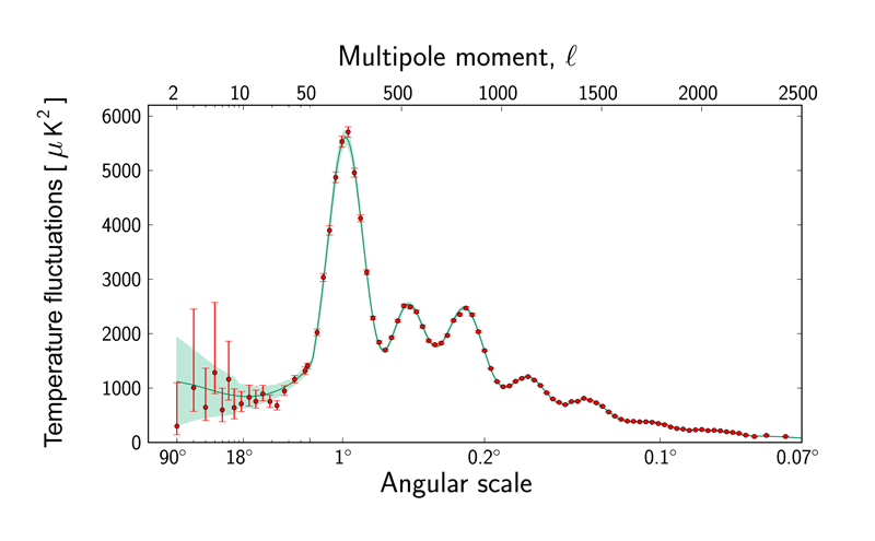
The power spectrum of the CMB. Image © ESA and the Planck Collaboration.
About this article
Marianne Freiberger is Editor of Plus.
This article is part of our Who's watching? The physics of observers project, run in collaboration with FQXi. Click here to see more articles about the cosmic microwave background.