Winter is coming: Where are we going?
Three months on from "freedom day" in England and it seems clear we're not out of the woods. Minutes published last week by SAGE, the Scientific Advisory Group for Emergencies, stressed the need for vigilance in what's still an uncertain situation, and recommended control measures should be prepared that can be introduced swiftly if needed. Reassuringly, modelling suggests we're unlikely to see a peak in hospitalisations this autumn and winter which exceeds that of January 2021, but future waves are still a definite possibility.
See here for all our coverage of the COVID-19 pandemic.
These Minutes from a recent meeting of SAGE have generated headlines surrounding the Government's Plan B, the vaccine booster programme, a return to home working, and even a potential Christmas lockdown.
But where do those modelling predictions come from and are they reliable?
Playing the numbers game
SAGE takes its input on epidemiological modelling from SPI-M, the Scientific Pandemic Influenza Group on Modelling (where "Influenza" is a legacy of when the group initially formed), which last week published a summary of its results. It covers modelled future scenarios of COVID-19 from mid October 2021 into 2022. The so-called Warwick model for COVID-19 is one of three models produced by independent academic groups (the others being Imperial College, LSHTM and Bristol) that formed part of this summary.
The Warwick model serves as a good example for how large-scale epidemiological models work. It was produced by a team from the Zeeman Institute for Systems Biology & Infectious Disease Epidemiology Research, at the University of Warwick, who are also members of the JUNIPER modelling consortium (you can see JUNIPER's news story here).
The concept of a mathematical model isn't quite as mysterious as it may seem at first. Most of us have probably dabbled in epidemiological modelling in our heads, especially at the start of the pandemic when we first became familiar with the now famous R number: the average number of people an infected person goes on to infect. For a value of R=3, a single infection (on average) causes 3 new infections, which in turn cause 3x3=9 new infections, which lead to 3x9=27 new infections, and so on, the power of exponential growth soon taking your breath away.
The Warwick model is a lot more sophisticated, of course, but it's built on the same general principle. The pandemic is a numbers game, and if you get the maths right, you can make useful projections on how it may unfold, based on specific assumptions.
The Warwick team uses a compartmental model, which divides a hypothetical population up into groups, based on their disease status. These can include compartments such as "Susceptible and vaccinated", "Susceptible and not vaccinated", "Exposed", "Infected and symptomatic", "Infected and asymptomatic" , or "Recovered and immune".
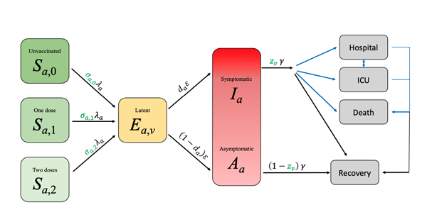
A schematic of the Warwick model. The letters on the arrows represent the parameters used to describe the rates at which people pass from one compartment to the other. Most of the rates are linear: each person leaves at a fixed rate independent of the state of the system. The only exception to this is the transition from Susceptible to Exposed where the rate at which each person leaves the Susceptible compartment is proportional to the number of Infectious people in the population. It is this non-linear term that generates the model complexity: it captures a lot of information, such as the mixing between age groups. Figure from this paper, used by permission.
People pass between a pair of linked compartments at a given rate over time. The rates can reflect how transmissible a variant is, people's age (different age groups come with different parameters), the efficacy of vaccines, people's behaviour (which impacts the rate at which people become exposed to infection), and the way they mix with each other. The parameters can also be made to vary over time, so we can see the effect of restrictions being tightened or loosened, or the waning of the immunity the vaccines provide us with.
The exact values of the parameters are estimated from the available data. This, the modellers say, is often the "hard bit", but once you have estimated those values, you can plug them into the equations that represent the set-up and watch a computer work out the possible future behaviour of the pandemic.
Uncertainties and scenarios
The all-important caveat here is that there is a lot of uncertainty surrounding the parameter values. In their latest report the Warwick team point to three key uncertainties. The first concerns the waning of the immunity afforded by the vaccines. We do know something about how immunity decreases over the medium term, but have no idea how it will play out over the longer term.
A second uncertainty is people's behaviour. As the EURO 2020 football matches have shown, this can have an important impact, but we don't know exactly how quickly people will return to pre-COVID behaviour in the absence of any government restrictions. Included in this uncertainty is the effect of the seasons: how do our different mixing patterns between summer and winter affect the transmission of this virus?
The third uncertainty surrounds the action of boosters. Tests on individuals that have been given a third dose of a vaccine against COVID-19 show that it boosts their immune response, but it is still unknown how this translates into protection or how long that protection lasts.
Modellers deal with such uncertainties by running a model for a variety of different assumptions for each of them (often in combination) that they believe covers the scale of possibilities. This then gives a range of scenarios we may encounter in the future.
The outputs
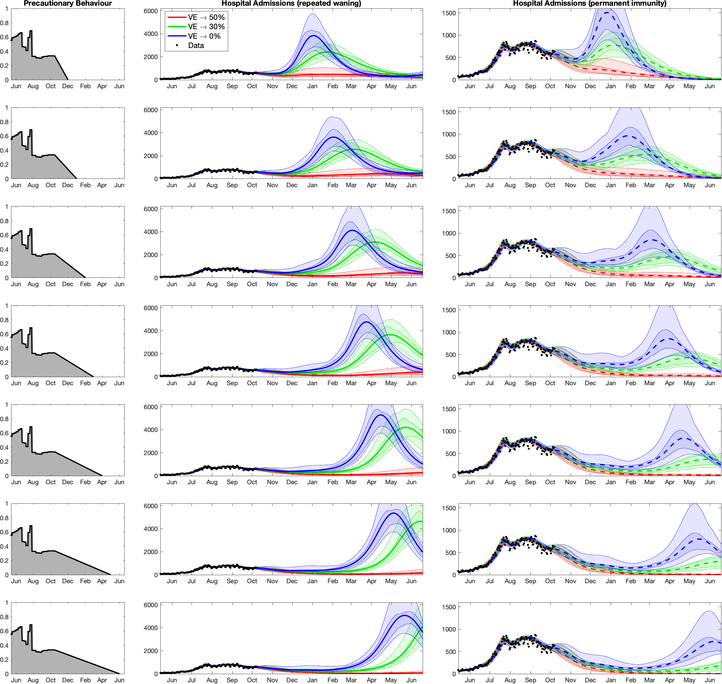
The figure below shows one of the outputs from the Warwick model for England, which the team included in their latest report. The figure shows possible projections of hospital admissions for COVID-19 for a range of scenarios, each panel corresponding to a particular set of assumptions.

The plots of projected hospital admissions are taken from the Warwick team's report, used by permission. Click here for a larger version. Note that the vertical axis of the right column is labelled differently to the vertical axis in the middle column: in the right column it only goes up to 1500, while in the middle column it goes up to 6000. This has been done so that all curves are clearly visible.
The first thing that meets the eye in these plots are waves of hospital admission: horrible, threatening waves. But let's take the pictures apart.
The column on the left corresponds to seven different assumptions of a parameter which measures how cautious people are. A value of 1 here corresponds to the level of precaution you'd find during an extreme lockdown, whereas a value of 0 corresponds to care-free, pre-COVID behaviour. It's assumed that this precautionary parameter steadily decreases to 0 over time. As you move down the panels in this column, it does so increasingly slowly: in the top panel it's assumed we are back to normality by December 2021, and in the bottom it's assumed that this doesn't happen until June 2022.
The other two columns show how hospital admissions are projected to behave over time from now until June 2022 for each of the seven assumptions on behaviour. The three colours in each of the panels represent three different assumptions on how the immunity provided by the first two doses of the vaccines wanes over time.
The most optimistic assumption about long-term vaccine efficacy is shown by the red curves. Under this assumption even though vaccine efficacy against infection does wane, it eventually settles down at a value of 50%, with efficacy against hospitalisation and death remaining at 85%. The blue curves are associated with the lowest levels of long-term vaccine-efficacy and so represent the most pessimistic assumption about waning immunity (0% against infection, but still 70% against hospitalisation). The green curves represent a situation which lies in the middle of these two extremes. In this scenario, vaccine efficacy against infection eventually settles at 30%, with efficacy against hospitalisation and death remaining at 79%.
The two columns represent two different assumptions about the action of the boosters, which are assumed to be given only to the over 50s. In the middle column it's assumed that the boosters give 90% efficacy against infection, but that the immunity provided by the boosters then wanes in a similar way to the waning observed after the initial two doses of vaccine. The right-most column is more optimistic, assuming that the booster vaccine provides 100% efficacy against infection, and that this only wanes slowly over the time-scales being considered.
The Warwick team think that the true state of affairs probably lies between these two extremes. (These aren't the only assumptions the team have made in their modelling — see the report for more details.)
Are the waves really going to happen?
Now let's return to those waves. We see that the highest waves in the plots are blue, corresponding to the scenario where vaccine efficacy against infection eventually wanes to zero — a pessimistic assumption. The peaks here are high enough to put significant pressure on the NHS, and they happen when the low levels of long-term vaccine efficacy are combined with either a very quick return to pre-COVID behaviour (top row) or a waning of the effectiveness of the boosters (middle column). Both of these lie towards the worst case scenario end of the spectrum of different scenarios considered by the modellers.
When you look at the red curves, however, you see no waves at all (over the time-scales modelled here): this means that if immunity due to the vaccines only wanes to about 50% efficacy against infection, then there aren't any peaks in hospitalisation, which is good news. The green curves are somewhere in between in all panels.
Thanks to the vaccines we're unlikely to see a wave in hospitalisations which exceeds that of January 2021. However, waning of immunity is a key uncertainty in the current modelling.
Overall, this tells us that one of the key uncertainties we're dealing with is the waning of the original two vaccine doses. The waning behaviour of the boosters is also important. It is represented by the difference between the middle and right-hand column. As you can see (noticing the vertical axis is labelled differently in each column), the optimistic assumptions about the waning of the booster (right-most column) leads to lower peaks, at least when there's a gradual return to normal behaviour (lower rows). To identifying the true scenario epidemiologists will need more time or more data, and work closely with immunologists and those gathering the data.
Another thing you can spot easily in the plots (comparing top and bottom rows) is that a slower return to pre-COVID behaviour pushes any peaks in hospitalisations further into next year. That's only to be expected, but there's another curious phenomenon visible in the plots: a slower return to normal behaviour (bottom rows) appears to lead to higher peaks in hospitalisations when the booster immunity wanes (central column). This, the team say, is precisely because slower return pushes outbreaks further into the future: by the time they arrive more people will be susceptible to catching COVID-19, thus a later outbreak will have more fuel to burn on. However, pushing waves further into the future is likely to be a good thing as it gives more time to plan the next move against this pandemic.
Unfortunately, modelling that reaches further into the future (whose results are not shown in the figure above) suggests that a quick return to normality could lead to additional waves later on, perhaps even before the end of 2022.
The Warwick team also modelled the effects the seasons might have to the spread of COVID-19 (see their report). Putting all this together led them to the conclusion that,
"A continuation in the observed decline in vaccine efficacy can generate very large-scale waves of hospital admissions in the next four to eight months, which can be further exacerbated by high levels of seasonal forcing. In contrast, vaccine efficacies that remain at a high asymptotic level of protection result in a continual decline in hospital admissions between now and June 2022."
An obvious way of tempering those waves would be to eventually give boosters to younger age groups or encourage more youngsters to take the vaccine, as this would push the population closer to herd immunity, or to give additional boosters to older age groups to maintain high efficacy.
Above everything, it is very clear that we need to meticulously monitor the situation, making sure we collect data that tells us how quickly and how frequently people who have been vaccinated or boosted become infected again.
How reliable are these results?
Mathematical models never give 100% sure-fire predictions — if they did, then some mathematicians on this planet would have turned out a lot richer than they actually are. It's possible, however, to take account of uncertainties in various ways.
One of them, as we've already explored, is to run a model on different assumptions, exploring a range of possible scenarios. Another approach that is standard in mathematical modelling is to use statistical tools to quantify the uncertainty in the model parameters when they are estimated from the data. This uncertainty can then be propagated through the model and reflected in the projections.
The shaded regions surrounding the main curves in the figure above do just that: given the data we have observed so far, there's a 50% probability that the actual curves lie within the darker shaded region around a curve and a 95% probability they lie within the lighter shaded region: the more certainty you want, the wider the envelope surrounding a curve.
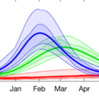
Another way to test the reliability of your model, and draw lessons on how to improve it, is to see how it has performed in the past. The Warwick team included in their report some plots of their last set of predictions, from July 2021, and compared those to what actually happened since then.
You can see these below. The graphs show the results for hospital admissions (left), hospital occupancy (middle) and daily deaths (right). The blue dots show the data available at the time, the yellow dots show real data as it has been collected since July, while the curves show the predictions the team presented in July, with different colours corresponding to different scenarios for how quickly people would drop their precautionary behaviour after freedom day (see here for the details).
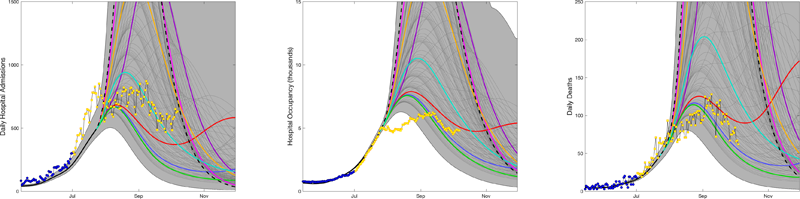
The plots are taken from the Warwick team's report, used by permission. Click here for a larger version.
Overall, it's nice to see that the vast majority of the actual data falls within the predicted envelope, and that the data is below the worst-case scenarios. This indicates that people didn't go back to pre-COVID behaviour as quickly as might have been feared. The left panel shows an initial rise in hospital admissions in July that wasn't predicted, followed by a sharp drop. This, the team suggest, is linked to large gatherings during the EURO 2020 football championships and the subsequent pingdemic.
The middle panel also shows a discrepancy between the data and the predictions: in August, hospital occupancy was significantly lower than had been projected. This could be because many of those going into hospital at that time were either younger or infected with the Delta variant, or both, which each mean a shorter stay in hospital. This is something the team hadn't factored into their July modelling, though they have now taken account of it.
The right-hand panel shows that, when it comes to deaths, the July projections also perform reasonably well, although the data during August generally lies within the lower envelope of scenarios.
The Warwick team was one of four groups within SPI-M that published their results last week (you can see the other reports here). Each group used their own methods to investigate what might happen in the future, but one thing seems clear: we can't yet be certain that the pandemic is over.
About this article
Marianne Freiberger is Editor of Plus. She would like to thank JUNIPER members Ciara Dangerfield, Julia Gog and Matt Keeling for their help in writing this article.
This article is part of our collaboration with JUNIPER, the Joint UNIversity Pandemic and Epidemic Response modelling consortium. JUNIPER comprises academics from the universities of Cambridge, Warwick, Bristol, Exeter, Oxford, Manchester, and Lancaster, who are using a range of mathematical and statistical techniques to address pressing questions about the control of COVID-19. You can see more content produced with JUNIPER here.