The tiger that isn't: numbers in the media
In their new book The tiger that isn't Michael Blastland and Andrew Dilnot have a look at numbers in the media and discover that while they can be made to back up all kinds of non-sensical claims, it often only takes a little maths to unravel faulty arguments. In this article they give us a taster of the book.
Numbers saturate the news, politics, life. For good or ill, they are today's pre-eminent public language — and those who speak it rule. Quick and cool, numbers often seem to have conquered fact.
But they are also hated, and often for the same reasons. They can confuse not enlighten, terrorise not guide, and all too easily end up abused and distrusted.
Potent but shifty, the role of numbers is frighteningly ambiguous. How can we see our way through them? First, relax ... .
We all know more than we think we do. We have been beautifully conditioned to see through numbers, believe it or not, by our own experience. Numbers can make sense of a world otherwise too vast and intricate to get into proportion. They have their limitations, no doubt, but are sometimes, for some tasks, unbeatable. That is, if used properly.
All in a number?

This rainbow is white - on average.
Most of what it takes to see through numbers is already used and understood in some part of their lives by almost everyone. We all apply the principles, we already understand the ideas. Everyone recognises, for example, the folly of mistaking one big wave for a rising tide. We know the vibrancy of the colours of the rainbow and we know what we would lack if we combined them to form a bland white band in the sky.
Knowing this can show us what an average can conceal and what it can illuminate. Imagine the drunk who sways down the street like a pendulum. On average he walks nicely down the centre line as cars whiz past on either side. On average he lives. In reality he gets hit by a bus. It only takes one person in the world to be born with just one leg to drive the average number of legs per person to below 2. Similarly, the average salary in the UK is skewed to the right by a few mega-rich earners. The average, one of our favourite measures of anything from government spending to the health of the nation, is by no means as representative as it's often made out to be.
Just as averages can distort in favour of extremes, extremely large numbers can glamourise things that are average at best. We are nicely evolved to deal with numbers that are small enough to be counted, but 10 zeros on the end of a number can make it incomprehensible — and make somebody look very generous. Take for example the numbers bandied around by the government for public spending. The UK Labour government proposed a £300 million fund over 5 years to provide one million new childcare places. This seems a huge amount for a very noble cause. But some simple arithmetic suggests otherwise. The amount equates to £300 per new childcare position over the five years. This then is £60 per year or £1.15 per week per child. Can you really fund childcare with this amount? No-one that we know pays that little!
Looking for one number to describe the whole is fraught with danger; no single number offers complete and instant enlightenment. Yet it doesn't take much mathematical skill to weigh up a single number's representative powers. Perhaps to our surprise, all of us possess the ability to unravel the arguments behind sometimes sensationalist claims.
Percentage of what?
Nevertheless, many people find it is easiest to distrust numbers wholesale, affecting disdain, rather than come to grips with them. Jealous of their prejudices or the few scraps of numerical litter they already possess, they turn up their nose at numerical evidence in case it proves inconvenient. Everyone pays for this attitude as it can result in bad policy, bad government and gobbledegook news.
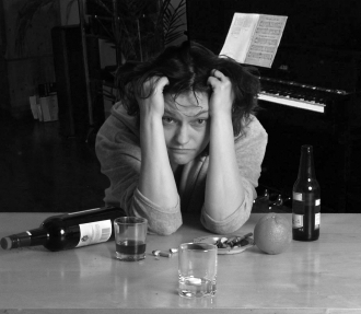
Sunday morning breast cancer?
Take, for example, a 2002 BBC news report claiming that "for every alcoholic drink a woman consumes, her risk of breast cancer rises by 6%". This is quite clearly nonsense — you don't see massive outbreaks of cancer every Sunday morning. But how does such complete rubbish become a headline?
No one suggests the BBC set out to fool the public — they themselves were mislead by the study results because numbers can often be used rather abstractly. What does 6% mean? 6% of what? This is clearly quite ambiguous. What this one sentence misses is that the 6% is associated with having an extra drink every day for the rest of your life, and that if there is normally a 9% risk of being diagnosed with breast cancer before you are 80, then drinking every day for the rest of your life raises this by 6%. But 6% of 9% is 0.54% — the new overall risk is actually now only 9.54%. What seemed like a massive risk increase is indeed quite small (only 0.54%) and would require you to drink a lot of alcohol.
Spotting subtleties
Still others blame statistical bean counters for a kind of crass reductionism, and think they, with subtlety and sensitivity, know better. There is sometimes something in this, but just as often it is the other way round. Most statisticians know the limits of any human attempt to capture life in data — they have tried, after all. Statistics is far from the dry collection of facts; it is the science of making what subtle sense of the facts we can. No science could be more necessary, and those who do it are often detectives of quiet ingenuity. It is others, unable to spot the subtleties, that are more likely to make mistakes.

Medical maths - it's vital to get it right.
As an example, take the group of physicians who were asked what the chance of a patient truly having breast cancer was, given that the test has a 90% chance of accurately spotting the cancer if you do have it, and a 93% accuracy of a correct reading if you do not. The extra information is that 0.8% of the sample in question (women between 40 and 50 years of age), actually have breast cancer. The immediate thought that springs to mind is, "well, it must be 90%" and a lot of the physicians snatched at this number.
But consider it this way: in a group of 1000 women typically 8 will have breast cancer. Of these 8 women, the test will report that 7.2 — rounding down to 7 — have cancer. There's the 90%. But of the 992 that do not have cancer, the test will report that around 70 do — this is the 7% chance of a false positive. Therefore, in the end, 77 women of the 1000 will test positive for breast cancer, but only 7 will actually have it. This means the chance you have breast cancer if you test positive is really only around 10% — not 90% like our initial instinct suggested. This is an amazing difference, and one that has the power to cause immense emotional and financial distress.
The tiger that isn't

Really there?
Another dragon better slain is the attitude that, if numbers cannot deliver the whole truth straight off, they are all just opinion. In that case, to protect ourselves from number trickery, we better go with what we can "clearly see" for ourselves. But here our evolutionary make-up does not always work in our favour.
We have an inbuilt natural ability to associate one thing with another — for example a rise in health problems with a nearby mobile phone tower. It was in our early ancestors' interest to do this: if a stripy pattern of light in the bushes conceals a tiger, then it's better to run than to be eaten. These days, however, we're more often wrong and it is simply chance at work. Many a basketball player — and fan — will have come across this. There are games in which a particular player seems unable to miss the basket. It's commonly said that he or she has a hot hand, but there's plenty of evidence to suggest that such runs could be due to chance alone and could happen just as well to another player of equal ability. A sober statistical analysis can show if a trend is a trend, or just coincidence.
So we should shun the extremes of cynicism or fear, on the one hand, and number idolatry on the other, and get on with doing what we can. And we can do a great deal. Seeing through the maze of numbers presented on a daily basis is a challenge, but it's not insurmountable. What we seek to do in our book is reconnect what anyone can know with what now seems mysterious — reconnect numbers with images and experience from life. If we have done our job, then what once was baffling or intimidating will become transparent. The alignment of power and abuse is not unique to numbers, but it is just possible that it could be uniquely challenged in this area, and that the powerless become powerful.
About the authors
 |
This article is adapted exclusively for Plus from the book The tiger that isn't — already into its third reprint and reviewed in this issue. Michael Blastland is a writer and broadcaster. He devised the More or Less programme on BBC Radio 4, and is also author of Joe - the only boy in the world. Andrew Dilnot is Principal of St Hugh's College, Oxford, was presenter of More or Less from its inception in 2001 until 2007, and former Director of the Institute for Fiscal Studies. The article is printed here with special permission from Profile Books. |
 |