
Maths in a minute: Voronoi diagrams
Imagine a city with a number of hospitals. When someone has an emergency you'd like them to always go, or be taken, to the hospital that's nearest to where they currently are. What you need is a map showing each hospital's catchment area: for anyone in that region, that hospital is closer than any other. How do you do that?
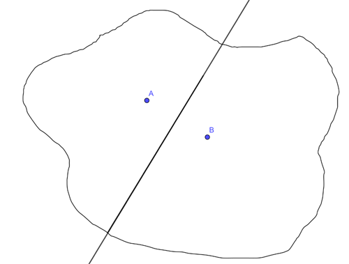
It's not hard, only possibly a little tedious if you do it by hand. Start with two hospitals at points A and B on the map. Draw the line segment that connects them, find the midpoint of that line segment, and then draw the line that passes through that midpoint and is perpendicular to the segment from A to B. That line divides the city into two regions. One of them, the one containing A, contains all the points closer to A than to B. The other contains all the points closer to B than to A. The points on the line are the same distance from A and B.
Now look at the third hospital, at point C. Repeating what we did above you work out the region of points that are closer to A than to C, and the region of points that are closer to B than to C. The region of points that is closer to A than to both B and C is now the intersection of the region of points closer to A than to B and the region of points closer to A than to C.
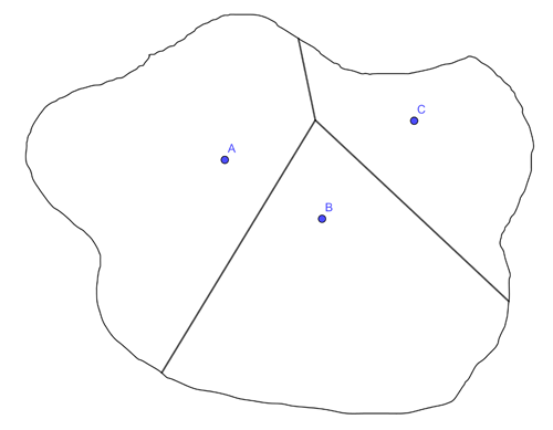
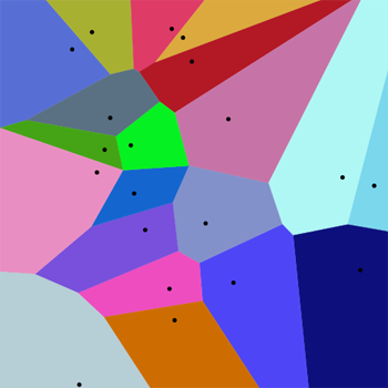
You continue like this, intersecting regions, until you have accounted for all the hospitals. The picture you get at the end, the division of the map into regions of points that are all closer to one of the given points than any other, is called a Voronoi diagram. It's named after the Russian mathematician Gregory Voronoi (1868-1908).
As you can imagine Voronoi diagrams are useful in all sorts of areas. For example, they can be used to study the growth patterns of forests, or help robots find clear routes through a set of obstacles. Wikipedia lists many other applications.
But we chose the medical analogy for a reason. In the 1850s a cholera outbreak was decimating Soho in London, killing 10% of the population and wiping out entire families in days. It was thought at the time that the disease was caused by "bad air", but physician John Snow had another idea: he thought that cholera came from contaminated water supplies, which in those days came from pumps positioned throughout the city.
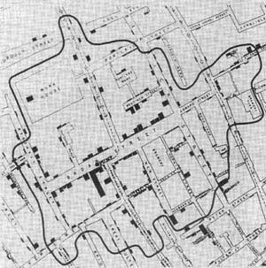
He was able to convince others of his theory by first marking the number of deaths at each address on a map of Soho. He then also identified the "catchment area" of a particular water pump at 40 Broad Street (now Broadwick Street). Points within this catchment area were closer to the Broad Street pump than any other pump — only that, unlike in our example above, Snow didn't use the direct distance a crow would fly, but the walking distance along streets and alleys. It turned out that almost all the deaths marked on the map lay inside the catchment area of the Broad Street pump and anecdotal evidence explained the few cases that did not.
This demonstrated very convincingly that contaminate water was indeed the cause of cholera. Today the spot where the pump once stood is marked by a memorial and there's a pub right next to it named in John Snow's honour. You can find out more in this article.
Comments
Kevin
There were puzzling inconsistencies which he carefully investigated; the local brewers were unaffected (no surprise there, they didn't drink the water!) and one woman who lived many miles away - she turned out to miss the distinctive flavour of the water from the Broad Street pump after she relocated and had a jug delivered fresh each day.
A truly great man.
tlsformo@alaska.edu
I was wondering whether there is a way to go from regions (or division of the map) to the points? In other words, assume shapes already represent a Voronoi diagram, can we determine the point within each shape, or is this impossible?
Anonymous
Wikipedia entry for "Voronoi diagram" says "The Voronoi diagram of a set of points is dual to its Delaunay triangulation."
https://en.wikipedia.org/wiki/Delaunay_triangulation