Mapping the medals
The London 2012 medals designed by the artist David Watkins. Image: London 2012.
Predicting the final Olympic medal count is a black art. Sport, with all its intricacies and vagaries, is always susceptible to variations in form, weather conditions and simple random events. But we like a challenge! Prior to the 2008 Olympics in Beijing, we took a look at the results of the 2000 Sydney and 2004 Athens Olympics (see Harder, better, faster, stronger). In this article we developed an equation that related a country's population and its gross domestic product (GDP) to its final medal count.
We've also taken a look at the effects of hosting the Olympics on a country's medal count (see The home advantage). This article showed that hosting the Games has a large influence on the host's medal count. Moreover, it showed that the previous host also has results better than would otherwise be expected.
We have combined the approaches from both these articles to predict the final medal tally for the top 20 countries for 2012. So without further ado, here is our predicted 2012 London Olympic medal count. You can see how our prediction stacks up on our interactive map, which is updated with the actual medal tallies every day during the Games.
| 2012 Predicted Position | 2012 Predicted Medals | |
| United States | 1 | 112 |
| Great Britain | 2 | 79 |
| Russia | 3 | 77 |
| China | 4 | 76 |
| Australia | 5 | 53 |
| France | 6 | 42 |
| Germany | 6 | 42 |
| South Korea | 8 | 32 |
| Ukraine | 9 | 29 |
| Italy | 10 | 28 |
| Japan | 11 | 25 |
| Cuba | 12 | 25 |
| Belarus | 13 | 21 |
| Canada | 14 | 19 |
| Spain | 14 | 19 |
| Netherlands | 16 | 17 |
| Brazil | 17 | 16 |
| Kenya | 18 | 15 |
| Kazakhstan | 18 | 15 |
| Jamaica | 20 | 12 |
But how did we come up with these predicted medal counts? The general idea is to take the 2008 results and then rescale them to take into account changing population, GDP and the home advantage. (We have assumed that the same number of medals are on offer in 2012 as there were in 2008. This is likely to be about right as there are the same number of events (302). However, you cannot predict exactly how many medals will be awarded as multiple bronze may be handed out in some events when there is a tie for third.)
Here are the steps we followed:
Step 1: Find all the relevant data
- The 2008 medal count (from Wikipedia)
- Country populations for 2008 and 2012
- Country GDPs for 2008 and 2012
Step 2: We will make our 2012 predictions based on the results from the 2008 Games. However, as hosts and previous hosts China and Greece respectively performed better than they would have if the 2004 and 2008 Games had been held in neutral countries, so we need to correct for this over-performance. In the article The home advantage we found that a country's success two Games before or after hosting the Games is roughly 60% as good as its performance when hosting the Games (see the chart below). We'll take this as a base-line result for countries that are not hosting the present Games, haven't hosted the previous ones and won't be hosting the next ones. So to scale back China's performance to pretend that it wasn't the 2008 host, we multiply its 2008 medal count by 0.6.
We also found that a country's performance one Games after it hosted the Games is roughly 68% of its hosting performance. So to scale back Greece's performance, we multiply its 2008 medal count by 0.6/0.68 = 0.88.
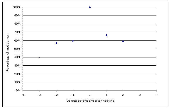
This chart was calculated using the average performance of the home country in terms of the percentage of medals on offer that were won, averaged over all Games post WW2 (except 1984 and 1988, which were affected by boycotts). The home result was then scaled to one. (See The home advantage for details.)
\textbf{Step 3:} We now find a mathematical formula which relates the countries' populations and GDPs to the corrected 2008 medal counts. The formula we'll use is $$ln(M) = 0.2814x - 2.8569,$$ where $$x = 0.46ln(GDP) + 0.54 ln(Pop),$$ where $M$ stands for medal count, and $Pop$ for population. (See the article Harder, better, faster, stronger to find out how we found this formula.) The formula doesn't give you an exact relationship, but out of all formulae of its type it fits the corrected 2008 data best.
Step 4: Now plug the GDP and population values for 2012 into the formula found in step 3.
\textbf{Step 5:} As we noted in step 3, the formula we found isn't exact. In the chart below we have plotted the straight line given by the formula in step 3. The dots show the actual corrected 2008 medal counts. To take account of this scattering, we multiply the results of step 4 by the ratio of the logs of their actual and predicted 2008 medal counts. This ratio is a measure of how far away their actual results were from the predicted ones. The net result is that we have corrected the 2008 results for changing GDP, population and the home advantages of China and Greece.
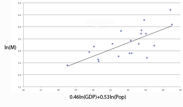
A straight line fitted to the corrected 2008 results. (See the article Harder, better, faster, stronger to find out how this is done.)
Step 6: Now we only need to adjust the predicted medal count of the UK for the home advantage and the predicted medal count of China for the post-hosting advantage. To do this we multiply the UK's predicted count by 1/0.6=1.66 and China's count by 1/0.88=1.33.
And voilà! This is how we got our results. See the table below for a comparison to the 2008 medal counts. The strongest influences in this modelling on the 2012 medal count, besides the 2008 results themselves, are the benefits of hosting the Olympics. Australia and Kazakhstan have had strong GDP growth, which shows in marginal improvements in the medal counts. One might expect that the results of Greece and Spain could have been worse if their GDP results reflected their recent financial troubles. In any case, assuming that the top 20 of 2012 will closely resemble the top 20 from 2008 is definitely the best first cut at the problem!
| 2008 Position | 2008 Medals | 2012 Predicted Position | 2012 Predicted Medals | Position Change | |
| United States | 1 | 110 | 1 | 112 | 0 |
| Great Britain | 4 | 47 | 2 | 79 | +2 |
| Russia | 3 | 73 | 3 | 77 | 0 |
| China | 2 | 100 | 4 | 76 | -2 |
| Australia | 5 | 46 | 5 | 53 | 0 |
| France | 6 | 41 | 6 | 42 | 0 |
| Germany | 6 | 41 | 6 | 42 | 0 |
| South Korea | 8 | 31 | 8 | 32 | 0 |
| Ukraine | 9 | 27 | 9 | 29 | 0 |
| Italy | 9 | 27 | 10 | 28 | -1 |
| Japan | 11 | 25 | 11 | 25 | 0 |
| Cuba | 12 | 24 | 12 | 25 | 0 |
| Belarus | 13 | 19 | 13 | 21 | 0 |
| Canada | 14 | 18 | 14 | 19 | 0 |
| Spain | 14 | 18 | 14 | 19 | 0 |
| Netherlands | 16 | 16 | 16 | 17 | 0 |
| Brazil | 17 | 15 | 17 | 16 | 0 |
| Kenya | 18 | 14 | 18 | 15 | 0 |
| Kazakhstan | 19 | 13 | 18 | 15 | +1 |
| Jamaica | 20 | 11 | 20 | 12 | 0 |
About the author

Marc West is a freelance science writer and former Assistant Editor of Plus who currently works in operations analysis in Sydney.
During the 2000 Olympics in Sydney he was doing Chemistry honours and his supervisor thought that it would be a great time to get a whole lot of work done as there weren't that many people on the roads (surprisingly) and the uni was quiet. Marc on the other hand thought it would be a great time to watch an awful lot of sport. They met somewhere in the middle. He is a reasonable table tennis player but before the Olympics he thought handball was a game you played on the concrete in primary school, not this massive European sport that no one in Australia has heard of! You can read more of his writing on his personal blog.
Comments
Anonymous
The numbers of gold medals won at the Olympic Games in Beijing in 2008 can be modelled by a modified version of Zipf's "law". Arrange countries in descending order by numbers of gold medals won, Where x = rank and y = number of gold medals, then y = 65.3x^(-0.5)+[0.11x-13.6] with R-square = 99.5% and standard deviation = 0.8.
Anonymous
I see Japan has 28 medals already, and Australia might struggle to get to 53....