
R's not all you need
When it comes to loosening COVID restrictions all eyes are usually trained on the famous R number. But as epidemiologists Julia Gog and Thomas House recently explained to us, there's also another important factor to consider alongside R. That's the prevalence of COVID-19 in the population: the proportion of people who currently have the disease.
See here for all our coverage of the COVID-19 pandemic.
Put simply, if prevalence has been so high that the NHS is in crisis, then opening up might stretch it to breaking point, even if R is less than 1, or would remain so. If, on the other hand, prevalence is very low, we might be able to tolerate a higher value of R as it would not immediately lead to many cases. This is true particularly if prevalence has been low for some time. (For an introduction to R see this article.)
We've illustrated this idea in the schematic plot below. The vertical axis measures prevalence and the horizontal axis measures R. Any point on this plot, such as the one we marked in black right in the middle, corresponds to a situation where we have the value of R that lies directly beneath the point on the horizontal axis, and the value of prevalence that lies directly to the left of the point on the vertical axis.
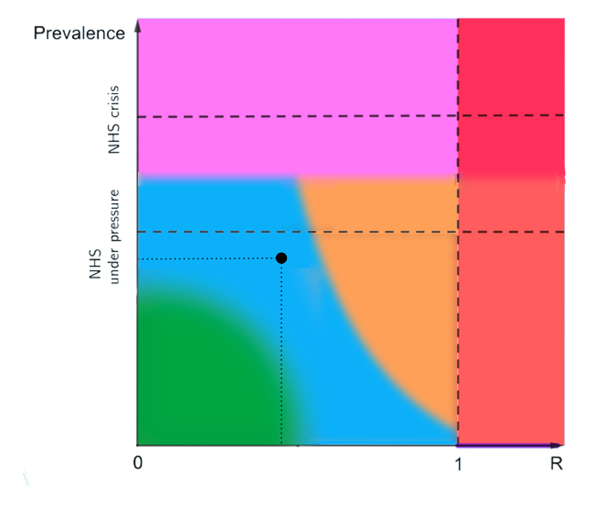
The horizontal axis measures R and the vertical axis measures prevalence. This is a schematic plot only, which is why we have not labelled the axes further.
The two dashed horizontal lines correspond to values of the prevalence which mean that the NHS is in crisis (top dashed line) or under considerable pressure (bottom dashed line). These are meant as abstract representations of the general situation, so we haven't indicated the exact values of prevalence they might correspond to. The dashed vertical line corresponds to R being equal to 1.
What do the coloured regions mean? First off, note that our plot is only meant to illustrate the idea that both R and prevalence are important factors, which is why we haven't attached further labels to the axes indicating exactly where one region ends and another begins.
The vertical red strip on the right represents the situations where R is greater than 1.
The horizontal pink strip at the top represents a situation where our healthcare capacity is in a perilous situation. Red and pink are situations we want to avoid.
The green region in the bottom left corner represents a situation where both prevalence and R are quite low, so lifting restrictions wouldn't land us in the red or pink zones any time soon.
The blue region represents a situation where the balance between prevalence and R is such that some careful easing of restrictions might be possible without quickly moving into red or pink — there is some breathing room in prevalence, even with R increased a little.
The yellow region represents a situation where the NHS is not in crisis and prevalence is not growing, but a small change could push R over 1 and very soon our health service would be at risk. If that happened, we'd need to react quickly — any delay would come at the price of a longer lockdown (see this article).
The narrow horizontal purple strip under the red represents a situation where, although R is greater than 1, prevalence is essentially zero and so there is no ongoing transmission in the community. There may however be sporadic introductions of the virus, for example through international travellers, which can be detected so that onward transmission can be stopped. This situation would allow us to go about many activities as the risk of infection is low, but it is unstable and requires great care to maintain. Any rise in prevalence would get us into the red zone. To avoid this we'd need to be vigilant, have very good surveillance to pick up introductions of new cases, and take action very quickly.
"Right now (late February 2021) I think we are in the blue region," says Gog, who is a participant of SAGE, and a member of the SPI-M and JUNIPER modelling groups. "We have come down a little bit in prevalence and R is around 0.7 or so across the UK. So we can open something, but not everything — one thing at a time, and then pause to check that we're still OK."
Why do the regions look like they do?
Most of the coloured regions in the plot have horizontal or vertical boundaries. These boundaries correspond to threshold values of prevalence or R that are deemed to be important. For example, the left-hand border of the red zone corresponds to R=1, a famously critical value. The top border of the blue region corresponds to a threshold value of prevalence: below it the NHS is under pressure, but above it the NHS is considered to be in crisis.
Exactly where those threshold values lie is a matter of judgment, but this judgment can be informed by sound reasoning and mathematics. For example, R=1 is deemed to be a critical threshold because the maths shows (see here) that the epidemic will shrink when R is less than 1 and grow and when it is greater than 1. That's why it's generally agreed that R greater than 1 isn't a good thing.
The most interesting boundary is the one separating the blue and yellow regions. Its curvy shape illustrates the interplay between R and prevalence particularly well. Suppose we are somewhere in the top left of the blue region, so the NHS is under pressure. "In this case you don't want to get too close to R=1, because then if you got your estimate of R wrong by, say, 10% you're in big trouble quickly," says Gog. However, if prevalence is low, so we're somewhere near the bottom of the blue region, we can tolerate R being closer to 1. "In that case you have a little bit of a breathing room if we've got it wrong or something new is happening." says Gog.
This is why the right edge of the blue region slopes down gradually, rather than dropping vertically, and extends under the yellow towards the line marking R=1. For lower prevalence, we can risk sailing closer to R=1 as it will take some time for cases to grow again to any given level. Again, mathematical models can inform the exact shape of the boundary between the blue and yellow regions. (For example, converting R into growth rate, and then using an exponential model to predict the growth in cases, can tell you what combinations of R and prevalence ensure that prevalence doesn't grow above your threshold value too quickly. These combinations can then be part of the blue region.)
Moving around the plot
How do we get ourselves from any point in the plot to another, hopefully better, situation? It turns out that, like pawns on a chessboard, we only have a limited number of possible moves we can make. Suppose we are at a given point on the plot and change nothing about our behaviour. Then if we are in a situation where R is less than 1, the epidemic will shrink and prevalence will go down. The value of R won't be affected any time soon — the only way R can change without us changing our behaviour is through people becoming immune by becoming infected, and that takes a long time. This means that doing nothing when R is less than 1 takes us vertically down on the plot, to a lower prevalence.
If we are in a situation where R is greater than 1 then not changing our behaviour will allow the epidemic to grow, and so prevalence goes up. This means we go vertically up in the plot. And the further right we are, the faster upwards we will go.
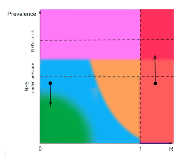
Not changing our behaviour will lead to prevalence going down or up, depending on whether R is less than or greater than 1.
The other thing we can do is loosen restrictions or tighten them up: this leads to a horizontal move on the plot, either to the right or left. "Suppose we are in the top bit of the blue region and reopen some of the things that are currently closed, then that steps us to the right. The big question is always how far." says Gog. "If we are in the red region and decide to lock down, then that brings R down, so that steps us to the left."
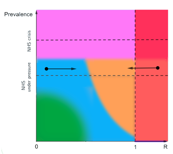
Loosening restrictions steps us to the right and tightening them steps us to the left.
"So if we are somewhere inside the red region and want to bring prevalence down we can't just step down, that's not an option. We have to go left first to reduce R and then wait for prevalence to come down." Working out how far a change in our behaviour can take us to the left or right, and how long we have to wait for prevalence to go up or down when we do nothing, is exactly the kind of question disease modellers like Gog and House are trying to answer using mathematical models.
Vaccination is of course another tool in our armoury against COVID-19, so where will it leave us on the plot? Gog hopes that it might get us to the bottom part of the yellow or blue regions if we are unlocking at a careful pace, paying attention to R and prevalence as we go. We should be able to get to where R is less than 1 and prevalence low. "But what we don't know yet is if vaccination is enough to let that happen and have most/all of our current interventions removed. It will depend on how effective the vaccine is, who is offered vaccination, and who agrees to be vaccinated." The answer will become clearer over the next few months, as we can see the effects of the vaccination programme and also gradual re-openings.
As we said above, our plot is only schematic which is why we haven't made explicit where one region ends and another starts (apart from the line corresponding to R=1). The exact locations of boundaries between regions will depend on many factors, such as health care capacity and what proportion of cases end up needing hospital care, which may vary both in space and time. However, the schematic plot serves as quite a good conceptual map illustrating the interaction between R and prevalence.
One question it raises is where on the plot we'd be happy to settle come, say, the summer? If low prevalence is a goal, then the answer is somewhere in the bottom part. But how far right are we willing to go? Aiming for R less than 1 could mean keeping some restrictions in place longer term, and letting it go above 1 will run the risk of explosive outbreaks and sudden and hard lockdowns. With all that's been going on it's a question most of us probably haven't had time to think about yet. But it's something that public debate will soon need to consider.
About this article
Julia Gog is Professor of Mathematical Biology at the University of Cambridge.
Thomas House is Reader in Mathematical Statistics at the Department of Mathematics at the University of Manchester.
Gog and House are members of the JUNIPER modelling consortium and the modelling group SPI-M, and they contribute to the Scientific Advisory Group for Emergencies (SAGE).
Marianne Freiberger is Editor of Plus.
This article was produced as part of our collaboration with JUNIPER, the Joint UNIversity Pandemic and Epidemic Response modelling consortium. JUNIPER comprises academics from the universities of Cambridge, Warwick, Bristol, Exeter, Oxford, Manchester, and Lancaster, who are using a range of mathematical and statistical techniques to address pressing question about the control of COVID-19. You can see more content produced with JUNIPER here.