El Niño: What on Earth will happen next?
El Niño is a climate event without equal. It affects almost every region of the globe, causing droughts in some areas, and floods, hurricanes and typhoons in others. Famine, disease, disruption to infrastructure and transport follow in their wake, causing humanitarian as well as economical problems. Understanding El Niño, and ideally predicting what it will do in a given year, is crucial — and here maths can go a long way.
What is El Niño?
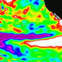
A strong El Niño event which occurred in December 1997. Red means a strong upwards deviation from the normal temperature and blue a strong downwards deviation. Near-normal temperature is indicated in white. Image created using data from the Met Office.
When scientists say that an El Niño event is happening, they mean that the sea surface temperature of a large area of the tropical Pacific ocean is unusually warm over a period that lasts several months. The effect was first noticed locally by people living in South America, and because the warming happens around Christmas time they dubbed it El Niño — it means "little boy" in Spanish, but when spelt with a capital N actually refers to the baby Jesus.
An El Niño event happens every few years and is often followed by an anomalous cooling of the sea surface, referred to as La Niña. Since the ocean interacts with the atmosphere, an El Niño event can lead to dramatic changes in the winds and rainfall patterns in the Pacific regions. These in turn cause changes in the atmospheric circulation world wide — which means that an El Niño event can impact regions as far apart as North America and Africa. There is no doubt about the knock-on effects, including an increased risk of diseases like malaria or cholera in areas effected by floods, and disruption to agriculture and economies world-wide. In 2014 economists of the University of Cambridge and the International Monetary Fund urged countries to "plan ahead to mitigate [El Niño's] effects".
What are the odds?
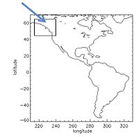
Region A.
One way of getting an idea of what will happen in the future is to look at the past. As an example, let's try to estimate the odds that an El Niño event in winter will affect a particular region of the Northwest of North America, call it region A (see the picture), in spring.
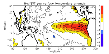
Below is a scatter plot of 60 years' worth of temperature observations, from 1951 through to 2010. For each winter (December, January and February) we have the Niño3.4 index: that's an average of sea surface temperature data from a key area of the Pacific. For the following spring of each year (March, April and May) we also have the deviation from normal of the air temperature over land in region A (using the statistical notion of standard deviation). Each cross on the scatterplot stands for a year with the winter Niño3.4 index marked on the horizontal axis and the temperature deviation (in the following spring) marked on the vertical axis. So a cross in the top right of the plot corresponds to a year in which there was a Pacific warming event in winter followed by a high temperature deviation in region A in the spring.
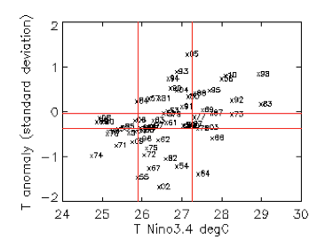
Now divide each of the Niño3.4 range and the region A deviation range into three intervals; low, medium and high. This divides the scatter plot into a total of nine rectangles. You can count the crosses that fall into each of these to get a contingency table.
| Nino3.4 low | Nino3.4 medium | Nino3.4 high | Total in row | |
| Deviation high | 1 | 10 | 9 | 20 |
| Deviation medium | 5 | 11 | 4 | 20 |
| Deviation low | 9 | 9 | 2 | 20 |
| Total in column | 15 | 30 | 15 | 60 |
You can see that out of 15 crosses corresponding to an El Niño event in winter (Nino3.4 high), nine also correspond to a high spring temperature deviation in region A. If we use this as an estimate of the risk that a winter El Niño event leads to a high spring temperature deviation in region A, then this gives us odds of 9/15, which translates to a 60% chance. So if you live in region A and there's an El Niño event in winter, you might want to prepare for a rise in temperature in spring.
This example is very basic. In reality scientists use the tools of statistics and probability theory to analyse past data more thoroughly, for example taking account of the limited number of observations. But still, you get the general idea. The pictures below summarise the worldwide effects of El Niño on land temperature and rainfall at different times of the year.
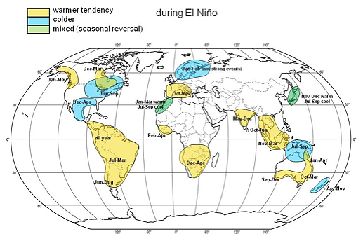
Temperature impact. Image from the Met Office website.
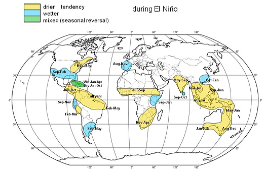
Rainfall impact. Image from the Met Office website.
How does it happen?
Another, and perhaps a better, way of predicting the future is to not just look at numbers, but really understand what is happening and describing it using mathematical equations. The picture below shows the normal Pacific ocean temperature. You can see that there's a warm pool in the West and a "cold tongue" sticking into the middle from the East. It's cold enough for penguins to feel comfortable there, which is why there are penguins on Galapagos.
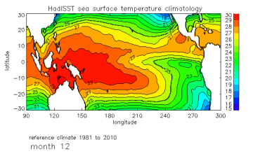
Sea surface temperature: there is a warm pool (red) in the West and a "cold tongue" (green) in the East near the equator. Image created using data from the Met Office.
But why is there a cold tongue near the equator, where there's plenty of heat coming from the Sun? It's down to the trade winds, which blow from East to West along the equator. The winds cause currents that bring cold water to the surface, an effect that is known as upwelling.
But this effect can be disrupted. Weaker winds lead to less upwelling, which in turn leads to a warmer sea surface. Because of the way the ocean surface interacts with the atmosphere, a warmer surface leads to even weaker winds, which mean even less upwelling, leading to an even warmer surface, and so on. What we have here is a positive feedback loop. It was first discovered by the meteorologist Jacob Bjerknes in 1969.
Not only does that feedback loop cause the sea surface temperature to warm up, it also warms it up at an ever-increasing rate: the higher the temperature, the faster the warming. It's exponential growth. We can express this using an equation. Writing $T(t)$ for the sea surface temperature at time $t$, the rate of change of temperature with time is given by the derivative $dT/dt.$ The feedback loop can be described as $$dT/dt = AT(t),$$ where the constant $A$ is a positive number that represents the net effect of several physical processes that drive the loop.But this isn't all. In the 1980s it was discovered that there is also a negative feedback loop at work. A change in the winds due to a warmer sea surface causes changes in the ocean circulation that spread slowly across the whole tropical Pacific. This leads to changes in ocean temperature along the equator below the surface. And eventually these lead to a cooling of the sea surface temperature several months later.
This effect can be described mathematically by the equation $$dT/dt = -B T(t-\Delta),$$ where $B$ is a positive number representing the physical effects in the negative feedback loop and $\Delta$ the time delay it takes for the loop to take effect (around 6 months). To describe the effects of both loops together simply add up the terms $$dT/dt = AT(t) -B T(t-\Delta).$$ This is called a delay differential equation. The mathematical model scientists use to understand how the sea surface temperature can react to the two feedback loops looks like $$dT/dt = AT(t) -B T(t-\Delta) + (\mbox{some other terms}),$$ where the other terms limit the amplitude of the temperature. The idea is to solve the equation, given some initial values, to find the function $T(t),$ which gives you some idea of what the sea surface temperature will be at time $t.$ Doing this for realistic values of $A$, $B$ and $\Delta$ gives the following solution: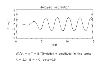
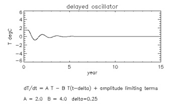
We see that the temperature oscillations peter out and there's no El Niño. This gives us good idea as to why we don't see an El Niño in the Atlantic or Indian oceans: they're simply not wide enough.
And now, the forecast
Even a simple model has some predictive power. In reality, to make forecasts a few months ahead, climate agencies use more sophisticated models that describe climate processes in a lot more detail. To monitor El Niño they use the TAO/TRITON array of buoys that was placed in the tropical Pacific in the 1990s and reports information of temperature, winds and currents in real time. (If you'd like to know what a lonely buoy floating on the Pacific is recording right now, visit the website.)
These sophisticated models, which include the Met Office's global seasonal prediction system GloSea5, make use of fluid mechanics, which involves the famous Navier-Stokes equations (you can read about them here). The models find solutions to special forms of the equations, using observed data as input. Obtaining detailed solutions, however, requires an enormous amount of computing power. The models also suffer from what is known as the butterfly effect: to predict the future they need to take as input climate information from today, and even a small difference in these initial values can snowball into a massively different prediction.
To counteract this effect you can run a model many times, each time with slightly different initial values. The result is an ensemble of simulated futures, which also gives you a way of computing the odds of what will happen in reality: if the bulk of the simulations predict an El Niño event, then you conclude that such an event is indeed very likely.
The picture below shows an GloSea5 ensemble forecast of Niño3.4, issued in May 2015. You can see that the temperature deviation (marked on the vertical axis) bas been getting larger, and the bulk of the simulations suggest that this trend will continue. So we can expect an El Niño event starting this spring and summer — watch this space!
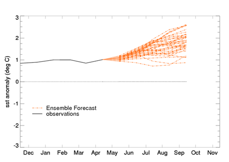
Image from the Met Office website.
Further information
- This Met Office page has sea surface temperature forecasts for the Pacific, as well as links to more information and impact maps.
- This website from Columbia University has a lot of information about El Niño, including collections of forecasts for comparison.
- If you'd like to have complex climate phenomena explained to you using very cute sheep dogs, then visit this website of the Australian New South Wales Department of Primary Industries.
About the author
Mike Davey is a research scientist at the Centre for Mathematical Sciences in Cambridge, working on climate dynamics and El Niño. He also works part-time for the Met Office in the seasonal prediction group.
Comments
Anonymous
I am a physical scientist. When I look at a scatter plot like the one that you made for temperature anomaly versus El Nino, I see a poor correlation (perfect correlation, 100% likelihood, would be a line) but admittedly one with a positive slope if one exists. I was interested in your method of analysis that reveals a stronger correlation. How did you determine where to draw the lines you used to separate the data into high, medium and low?
Marianne
Dear physical scientist. There is more information in this paper http://www.sciencedirect.com/science/article/pii/S2212096313000053 which is free to access. We hope that helps!
Anonymous
I have always had the following misgivings about El Niño: if it is a real effect, why was it not noticed before? (As far as I remember, it became fashionable in the 1980s.) After all, it is supposed to be a planetary effect... And, to my knowledge, it is not related to global warming.
The Rare Gem
What will happen next is the great coming of the Lord Jesus Christ who some have rejected. Discoveries in science has limitations and there are times that the discoveries do not recognize the underlying effect it may pose. I consider that most time, knowledge of science solve problems at the expense of creating another one. What will happen next to earth had never happened before and will never happen again after its occurrence. The race of man is going to an end.Everything in the universe will fade away including the earth itself.Only those who live for Jesus Christ will live after this occurrence in a world that no one can describe. It's beyond us.Let's live for Christ as we grow in our research. I really appreciate this post.
Thanks