From restaurants to climate change
We live in a world full of information and it's a statistician's job to make sense of it. This article explores ways of analysing data and shows how they can be applied to anything from investigating diners' tipping behaviour to understanding climate change and genetics.

These days tips are often added to the bill automatically.
Have you recently sat down in a lovely restaurant, picked up the menu, and read "12.5% discretionary service charge will be added to your bill"? In the UK this is now a common occurrence. In the USA the extra service charge is often made dependent on the size of your party: if you're more than six people, the charge will be added automatically. So what is the connection between party size and service charge?
Fitting a line
One reason for this fairly recent change in procedures is that restaurant owners and workers collect data on their diners, and it has been discovered that larger dining parties tend to tip less. Here's an example of how this might be studied. We collect the tips and total bill paid by all dining parties, at a restaurant over several weeks, or months, along with the size of the dining party. We compute the tip percentage, by dividing tip by total bill, and multiplying by 100. Now we fit a straight line to the data, a technique called linear modelling: assume that tip rate ($\hat{y}$) and party size ($x$) are related to each other by the straight line function $\hat{y} = ax + b$ for some numbers $a$ and $b$. There are standard techniques for finding the values for $a$ and $b$ that give the line which best fits the data. This involves looking at the sum of squared distances between the points and the line, and choosing $a$ and $b$ so that this sum is minimal.
For data recorded at an American restaurant in the 1990s this procedure gives the line shown in figure 1, with a slope of $a=-0.9$ and intercept of $b=18.4$ (giving the value where the line meets the $y$-axis at $x=0$.)
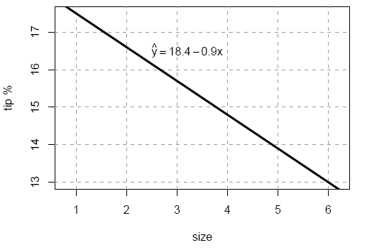
Figure 1: Tip percent as a function of party size.
The model says that the tip rate decreases by a little under 1% for each additional diner in the party. When the party size is 1 the tip rate is about 17.5%, but for a party of size 6 the tip rate drops to 13%. But how well does this model describe the actual data? Statisticians assess the goodness of fit by plotting the data and the model, and calculating a numerical value which measures the discrepancies.
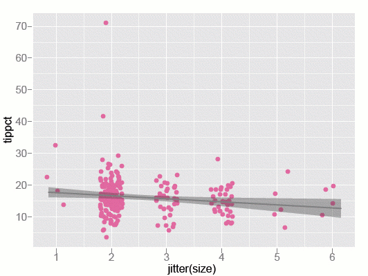
Figure 2: Tip percent as a function of party size - observed data and model.
The plot of the data with the model overlaid is shown in figure 2 above. The points are the values for each dining party — 244 in total. The model is represented by the line, and the grey band indicates uncertainty about the line. Because size takes integer values, and we are concerned that some points might be plotted on top of each other, we have "jittered" the values for size of the party, by spreading them out horizontally. The jittering is purely for visual purposes — it doesn't affect the model, or our interpretation of the relationship between tip rate and party size.
We notice a lot from this plot. We can see that there were only four parties of size 1, people dining alone. There were also only four parties of size 6! There are two outliers in parties of size 2: one dining party gave a tip close to 70%, and another about 40%. The data is also very spread out around the linear model, which suggests that size of the dining party doesn't explain the tip much at all!
Conflicting evidence
To calculate a numerical value of the goodness of fit, statisticians compute the difference between the observed and predicted tip, square these differences and sum them. This is related to the quantity called $R^2$. It will range between 0 and 1, with 1 being a perfect fit to the data. It is interpreted as the fraction of the variation in $y$ explained by $x$. For the tips data $R^2=0.02$. This is very, very low. It suggests that party size explains just 2\% of the variation in tip. That's not much!
However, this model is statistically significant. Recall that the model is based on two parameter estimates, $a$, the slope of the line, and $b$, the intersection of the line and the $y$-axis. The slope parameter is the most interesting, as it determines just how much tipping behaviour changes as party size grows. If there is no relationship between party size and tip, then the "true" value of $a$ should be 0. It is possible to work out the probability of observing the value -0.9, or less, for $a$, given that the true value is 0. This probability is 0.026. These calculations are based on the fact that the parameters $a$ and $b$, under certain assumptions, follow a so-called $t$-distribution.}
These are really low odds: if one collected 100 restaurant samples of 244 dining parties, and there is truly no association between party size and tips, then only about 2 of these samples would have slopes of this magnitude or more. We wouldn't gamble with these odds unless the cost was low and the pay-off high. So we decide that the true slope cannot be 0, that there really must be a relationship between party size and tip. This type of argument is most likely driving restaurants' new procedures.
Nevertheless it doesn't get us past the fact that party size explains only 2% of tip, at least for our data. It might be a statistically significant relationship, but it's a very weak relationship. Now our data is but a small sample of restaurant data, but we do suspect that the patterns might be similar in other data. In general, we suspect that there is only a very weak relationship between size of the dining party and tip rate. The evidence doesn't support restaurant policy of fixing the tip rate for large parties. So why is it that restaurants feel compelled to do this? One suspects that there are ulterior motives. Perhaps, fixing the tip rate will reduce the variability in tips: larger dining parties will have larger total bills, and removing variability will stabilise earnings for staff.
Digging deeper
Statisticians like to develop evidence based on data to study problems like this. For the tipping problem, a statistician will delve further into the data, to learn about other factors that influence tips. Figures 3 and 4 show deeper investigations of tipping patterns. The tip and total bill are given in US dollars. In the histogram of tips we can see many peaks. Look carefully and you'll see that they occur at the full and half-dollar values: People tend to round their tips.
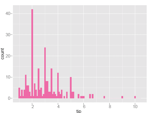
Figure 3: Histogram of tips. Peaks occur at full and half-dollar amounts indicating that people tend to round their tips.
In the scatterplot (below) of tip against bill, a guideline indicates a rate of 18% tip. Points close to the line are dining parties that gave approximately 18% tip. There are a lot of tips far below the line, which are tips far less than 18%. There are more of these "cheap-skate" tips than there are generous tips. When we study this relationship for subsets of the data (right plot) more interesting patterns emerge. Smokers (bottom row) are much more varied in their tipping than non-smokers (top row). Female non-smokers are very consistent tippers: with the exception of three low tips, the points are tightly located near the 18% line.
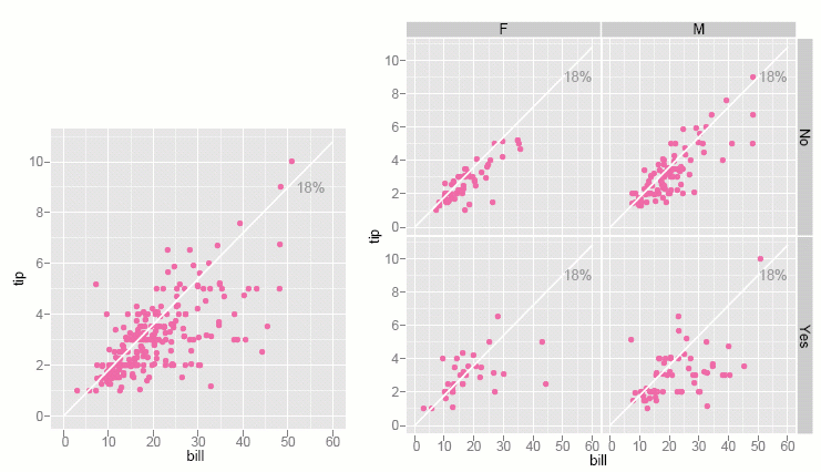
Figure 4: Tip against total bill, and (right) separately for gender and smoker. There are more cheap tips than generous tips, and smokers are much more varied in their tipping patterns than non-smokers.
From restaurants to climate change
What conclusions to draw from the tip data is a question for restauranteurs and psychologists. The interesting thing from the mathematical point of view is that methods like these can be applied to many current, more complicated problems. Figure 5 shows how linear modelling can be used to study climate change.
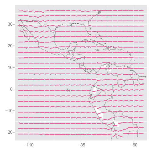
Figure 5: Studying climate change - Models of temperature against month for locations in the central Americas show an increasing temperature over the six years at high altitudes. White spots indicate locations of glaciers in the Andes, which overlap with regions of great temperature increase.
For each gridded latitude and longitude a linear model is fitted to temperature and time. Just as with the restaurant data, we find the straight line that best describes how temperature changes as time goes by. The models are shown as pink in the plot. Some locations have a very flat trend, some have a steeply increasing trend, particularly those in the high altitude areas of the Andes, and mountains of Mexico. In the Andes region we've indicated the locations of glaciers in white, which coincide with the temperature increases. So the stories we read in the media about glaciers melting is supported by the findings from this data: the temperature in the region of the glaciers is increasing rapidly. We also see that temperature is not increasing at all locations in this region, at least over this time period: the term "global warming" commonly used in the media is perhaps misleading. Our data suggests that warming is not uniform, and there are differences in the temperature trends at different locations.
Sparse data
In our two examples the data was relatively easy to analyse: you use simple models to study tipping behaviour or temperature at various places around the world, and it's easy to determine whether the observed patterns are real or due to random variation. A more difficult challenge comes from situations where the sample is small, but a lot of different measurements are made on each sample point. Data like this is called sparse data, and the difficulties posed by this type of data were recently discussed at a research programme at the Isaac Newton Institute in Cambridge. The challenges here are, firstly, to see if there is anything different from randomness, and secondly, if there is structure, in which part of the data space it exists.

Sparse data arise, for instance, in current studies of biological systems. An example involves transcriptomics data: researchers will take a tissue sample from an organism and measure the amounts of many thousands of different mRNA fragments — let's call these genes. mRNA is the chemical blueprint for encoding a protein product, describing the organism's genetic response to stimulus. Samples are usually taken from different conditions: for example, in development studies samples will be taken from organisms at several times.
The task of the statistician is to determine which of the genes is differentially expressed over the time course, and thus likely to be controlling the development. Differentially expressed means that the amount of the mRNA in the sample changes substantially. The number of genes having statistically significant differential expression should be relatively small, so it's a bit like finding a needle in a haystack!
In our example data, measurements have been taken on 22,810 genes at six different times with two replicates at each time. One way to approach the analysis of this data is to fit a separate linear model for each gene, that is 22,810 models. In each model $x$ is the time the sample was taken, and $y$ is the amount of mRNA in the sample. In Figure 6 all 22,810 models are shown (blue), and each line is graphed with some transparency.
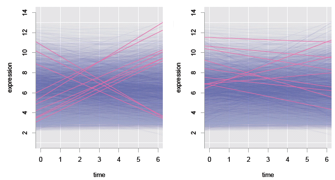
Figure 6: Studying transcriptomics data: linear fits to 22,810 genes (transparent blue), with models for the top 10 genes overlaid (pink), according to slope (left) and statistical significance (right).
We are most interested in the models with large positive, or negative slopes, because these correspond to genes that change the most with time, and probably control the organism's development. Most fits are very flat — these are uninteresting genes. Just a few have large positive or negative slopes — these are the genes that are interesting. The models having the ten largest slopes are overlaid (pink) in the left plot, and the ten most statistically significant models are overlaid (pink) in the right plot. It is a tad surprising that the most statistically significant genes don't all have large slopes!
There are two issues at play here: some genes might express a little but still have a large impact on the organism, and with so many models, a substantial number are likely to be incorrect. By fitting separate models for each gene, we account for biological differences in expression from gene to gene. Genes having a small change in expression over all samples can still be detected as having significant change: thus some of the statistically significant genes have small slopes.
We can address the second issue of there being errors in the models using the same logic as for the tips model earlier in this article. We might find that the odds of a single model being wrong are 5%. But 5% of 22,810 is more than 1,000 — so more than 1,000 of the genes are modelled incorrectly. Probably a substantial number of the genes have been incorrectly tagged as having statistically significant differential expression. This paradox arises from the sparseness of the data.
For this problem, the dilemma is to decide which genes we should report as being the most interesting ones to follow up with further experiments: the statistically significant genes with smaller slopes, the not-so-significant genes with larger slopes, or some combination of the two.
Solving these problems involves careful use of probability, geometry, and understanding the nature of randomness. Approaches to sparse data like this lie at the centre of much current research interest.
About the author

Dianne Cook is a Professor of Statistics at Iowa State University. She researches methods for visualising high-dimensional data using interactive and dynamic graphics, in many different applications including bioinformatics, climate systems, ecology, and economics.