Understanding uncertainty: Small but lethal
Comparing and communicating small lethal risks is a tricky business, yet this is what many of us are faced with in our daily lives. Ideally we need a "friendly" unit of deadly risk. A suggestion made in the 1970s by Ronald Howard is the use of the micromort: a one-in-a-million chance of death. This is attractive as it generally means that we can translate small risks into whole numbers that can be immediately compared. For example, the risk of death from a general anaesthetic (not the accompanying operation), is quoted as 1 in 100,000, meaning that in every 100,000 operations we would expect one death. This corresponds to 10 micromorts per operation.
We can also consider the 18,000 people who died from "external causes" in England and Wales in 2008. That's those people out of the total population of 54 million who died from accidents, murders, suicides and so on (see the Office of National Statistics website for more information). This corresponds to an average of $$18,000 / (54 \times 365) \approx 1 micromort per day, so we can think of a micromort as the average "ration" of lethal risk that people spend each day, and which we do not unduly worry about. Micromorts are also being used to compare death risks in different countries.
A one-in-a-million chance of death can also be thought of as the consequences of a form of (imaginary) Russian roulette in which 20 coins are thrown in the air: if they all come down heads, then the subject is executed (the chance of this happening is 1 in 220, which is roughly equal to one in a million).
It immediately becomes clear that a measure such as a micromort needs a unit of exposure to accompany it, and we can consider different sources of risk that naturally give rise to different measures of exposure. Here we briefly consider transport risks, medical events and leisure activities. Of course, we can only quote average risks over a population, which neither represent your personal risks, nor those of a random person drawn from the population. Nevertheless they provide useful ballpark figures from which reasonable odds for specific situations might be assessed. How you interpret these numbers depends on your philosophical view about what probabilities really are. Do they exist as properties of the external world, in which case the assessed odds can be considered estimates of the "true" risks, or are they only subjective judgements based on currently available information? We favour the latter interpretation.
Transport
Options for comparing forms of transport include miles-per-micromort, micromort-per-100-miles, micromorts per hour and so on. We compare the first two options below: although the general advice is that larger numbers should correspond to larger risks, miles-per-micromort seems attractive, especially when used to provide a calibration against other risks, as described below. See the figures below for how far you can travel per micromort and to see micromort per distance travelled using different modes of transport.
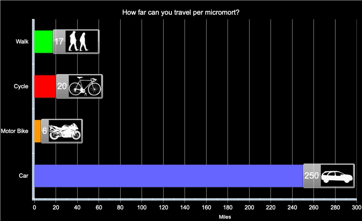
Distance travelled per micromort (one-in-a-million chance of death) for different forms of transport in the UK, based on assumption of constant risk within transport type and over time.
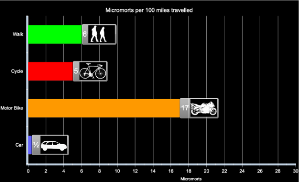
Micromorts per distance travelled for different forms of transport in the UK, based on assumption of constant risk within transport type and over time.
Medical events
What about going into hospital? Each day in England around 135,000 people occupy a hospital bed and inevitably some of these die of their illness. But not all these deaths are unavoidable: in the year up to June 2009, 3,735 deaths due to lapses in safety were reported to the National Patient Safety Agency, and the true number is suspected to be substantially higher. This is about 10 a day, which means an average risk of around 1 in 14,000, assuming few of these avoidable deaths happened to out-patients. So staying in hospital for a day exposes people, on average, to at least 75 micromorts. This is equivalent to the average risk of riding 420 miles on a motorbike, say between London and Edinburgh. The conclusion: hospitals are high-risk places.
Medical events are specific discrete occurrences, so the natural measure is risk per event, for example giving birth, having a Caesarean section, having a general anaesthetic. The exception is spending time in hospital, which is expressed as micromorts per night spent in hospital.
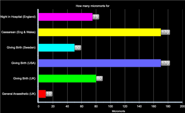
Micromorts per medical event in England in 2008, based on assumption of constant risk within event type and over time.
Comparison of the numbers for transport and health are informative: for example having a general anaesthetic carries the same risk of death, on average, as travelling 60 miles on a motorbike. The high value for a night in hospital is derived from National Patient Safety Agency reported adverse events resulting in death: reasonable probabilities may be considerably greater than this value.
Leisure activities
We assume that the risk comes from a specific accident in what is otherwise a safe activity with no chronic ill-effects. It is therefore natural to look at micromort per activity. The activities take different lengths of time, so it would be possible to express the risks as micromorts per hour, but this does not seem to reflect the choices that people make. Instead, we look at micromorts per episode, that is micromorts per horse ride, per scuba dive, etc.
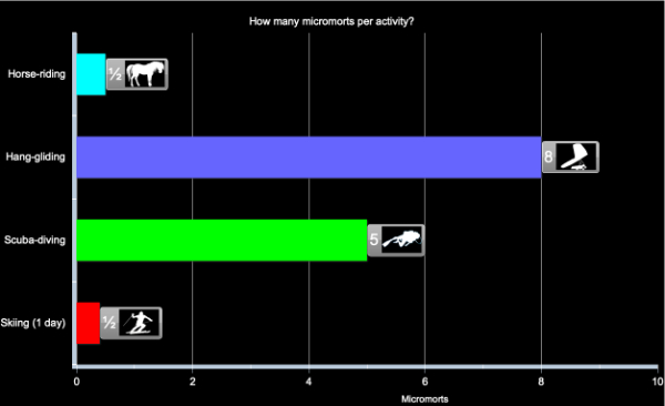
Micromorts per activity, based on assumption of constant risk within activity and over time
All these examples concern sudden deaths, but many risky behaviours have a delayed impact, such as smoking or an unhealthy diet. Comparing acute and chronic risks is tricky, but there have been a number of suggestions for "riskometers" which attempt to put both immediate and delayed risks on a common scale. Options include
- Listing causes of death, which allows a comparison of how many people, for example, die from accidents compared to heart disease, but does not directly allow the comparison of alternative daily activities.
- Transform lifetime risks, say of dying from cancer due to smoking, into risk per day by assuming, say, around 30,000 days in a lifetime. No allowance is made for delayed effects.
Other more complex options have been suggested, but none seems entirely satisfactory. But a useful image may be as follows. Each of the acute risks described above could be considered a lottery with a million tickets — if you expose yourself to a micromort it is like being given a ticket in this lottery, and if your number comes up then sadly it is the end of your life. However if you do not "win" this bizarre lottery, then you can throw away your ticket and start another risky day with a clean slate.
However with chronic risks such as smoking and bad lifestyle, you get given tickets as you puff away and stuff yourself with junk food. but you don't get to throw the tickets away — they keep on accumulating and as the lottery draw gets made each day your chance of winning get higher and higher.
So try not to collect too many tickets.
About the authors

David Spiegelhalter

Mike Pearson
David Spiegelhalter is Winton Professor of the Public Understanding of Risk at the University of Cambridge.
Mike Pearson created the figures for this article.
Mike, David and the rest of their team run the Understanding uncertainty website, which informs the public about all issues involving risk and uncertainty.
Comments
Anonymous
Thank you for your article on small risks.
It's one of the most intelligent and relevant things I've stumbled upon on the internet for a while.
Anonymous
Your very first assumption is wrong, because 54 million people don't die in the UK each year. From that point the rest of your article is based on this misinformation. Does it still hold up if you re-calculate everything based on 60,000 people in the UK dying per year?
Marianne
Hi! The figure of 54 million is irrelevant to the rest of the article, which aims to describe the concept of a micromort and how it's used to measure risks. The calculation is just an illustration, changing the numbers dosen't change the ideas!
Anonymous
The sentence is ambiguously worded, he's saying that 18,000 people die from accidents from a total population of 54 million. Not 54 million dead.
Anonymous
The sentence would be improved by the insertion of two commas: one after "people" and one after "million".
Great article and wonderful visual displays of quantitative information.
Anonymous
In fact, you misread the sentence. It states that 18,000 people "out of the total population of 54 million" died of external causes. That means the total population is 54 million, and 18,000 of those people died in 2008 of external causes.
Anonymous
Hi,
Thank you for a brilliant visualisation of risk.
Can I simply add micromorts together? For example giving birth in UK and spending 2 nights in hospital = 230 or is it (I suspect) a little more complicated than that?
Also, are you able to use morbidity data to calculate "micromorbs" (ration of non-lethal risk)? For example, the risk, or micromorb, of experiencing lobar pneumonia following a general anaesthetic.
Greg.
http://nontimeosedcaveo.wordpress.com/
Anonymous
If the outcomes of two risky events are independent and their probabilities of causing death are p1 and p2, then the probability of at least one of them leading to death is p1 + p2 - p1*p1. So, using micromorbs m1 = p1*10^6 and m2 = p2*10^6 leads to the following micromorb value for two independent risky events
m1 + m2 - m1*m2*10^-6
Jim
http://jvwhite.com
Anonymous
It should be:
m1 + m2 - m1 * m2 * 10^-12
Jim Ronback
Anonymous
All we need now is a pleasure measurement then we can really compare (incidentally I regard motorcycling as a pleasure activity only incidentally transport) -50 years riding including 20 years racing them is a hell of a lot or micromorts but also a hell of a lot of fun...
Anonymous
for those patients, 1000 micromort or more not in hospital for a night, perhaps. Those patients have to make choice which has less micromorts.
Anonymous
Hi. Why do I have to click so much to see the charts? This is tedious! Imagine if every article did this.
Anonymous
Great animation. For me (as a GP), what would be even more useful is to have some health risks (Eg anaesthetic, smoking etc) on the same chart as everyday risks like cycling, driving, etc - i think context is everything when trying to explain risk to the public.
Tom
Anonymous
Fascinating stuff. Is there a possible discreprancy between using historical information to obtain the statistics, and, using those statistics to make decisions?
I am in hospital, about to give birth. The Doctor recommends a caesaren due to complications.
Using the table above I know that the risk of death for a caesarean is more than twice that for a natural birth (UK).
Should I refuse?
Are the people who refuse caesareans missing as a seperate entity? perhaps these would have very high micromorts?
Do the Natural Birth stats include the deaths of people who refused the caesarean? If so, the micromorts for natural birth might be higher than they should be.
Finally, is it possible that caesareans are recommended when they should not be?
Martin
Anonymous
I would love to see flying on a commercial airline added to the chart. I am planning to go on a trip soon, and I was thinking how people are concerned about plane crashes, but you are probably more likely to die driving to the airport than in a plane crash. How many micromorts would each be?
Anonymous
I heard of micro-morts during David's appearance, if you can 'appear', on the radio. It's such a great concept I bored folks with it all day. The sums are easy too. To answer the last correspondent; there are 117 deaths per billion plane journeys (http://en.wikipedia.org/wiki/Aviation_safety#Statistics) = 0.12 micro morts, and 40 deaths per billion car journeys = 0.04 micromorts. We have to assume that the car journey to the airport is average in length and so is the flight.
The airlines of course like to talk about deaths per kilometer travelled, which, given the vast distance aplane can go, look far more favourable!
Anonymous
At age 80, I am still consulting in the industry of my choice in 1958, the semiconductor industry.
Since the latest banking-generated depression of 2009 my work has been reduced but thru the use of the internet and Google hangouts as well as Skype calls my old clients are saving travel reimbursements and of course have renegotiated daily fees, but I still do data analysis for the senior management for their newest products. We use JMP software links to their engineering databases, and list of new product contacts for validation of hints found in the tester file data. Many early lots of chips are subjected to DOE's but they keep good experimental design notes due to efforts we made decades ago in setting up the data acquisition systems linked to their MES systems, SPC systems, test system file repositories, and eventually "Yield Management Databases" that attempted to provide "one stop shopping" for the R/D, Development, Test, Product, Process, and Equipment Engineers that support these very large enterprises. I sent your web links with comments to my clients and friends, and plan to add the link to my Linked In discussion groups. Are industry is data-rich which can be information-poor without the use of statistical methods beyond the old p-value hypothesis tests.
Graphical illuminations have been my focus for sharing ideas since the pencil and paper and slide rule era, and during my full time career (1958 to 1998). Since then my consulting years have only proven how important visualizations are in problem solving or investment.
My weakness in early math training without Linear Algebra or Statistical Probability and Risk methods (vs SPC, DOE, and Materials Science) has been helped from time to time by Simulations that were based on Physics hiding the underlying math complexities. Given that background, and being skeptical by nature, I really appreciate the newer web-based simulations like yours and some earlier ones from Rice Univerity and others. I sent your site links to my mailing list for comments and got many favorable replies. We also monitor the "Big Data" sites that use Visualizations to Illuminate otherwise very complex issues.
I think the younger engineers will live in a much more visual world than we did with our K&E graph paper and slide rules and log tables. But they need examples like yours to help them SEE and THINK. Illumination! Dorian Shanin once told us that engineers tend to use statistics like a drunk uses a lamp-post, for support rather than illumination. He was right, for more than just the engineers he was teaching. Visualizations are the most illuminating tools in the statistical toolbox from the Box Plots to your Animations. Thanks.